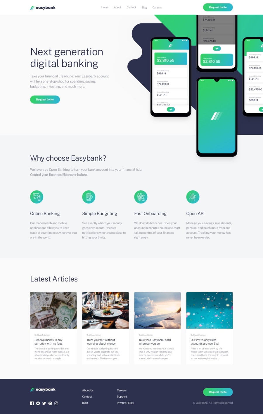
Design comparison
Solution retrospective
Hi everyone!
This is the first challenge I submit on this platform. I really like this concept, because it helps sharpen our skills using real live projects (or close to that). I decided to use simple HTML, CSS and JavaScript because this project didn't require too much functionality, therefore I felt that using something like react would be overkill. What I liked about this project is that it seemed simple on the surface but you needed to put some effort on the positioning of items. The one thing I couldn't solve was to put a gradient border color on the navbar links (the one that is active).
I would gladly receive some feedback from you (and if you know how to add the border with gradient, please let me know).
Community feedback
- @ApplePieGiraffePosted over 3 years ago
Greetings, sergiobarria! 👋
Good job on this challenge! 👏 Your solution looks good and is responsive! 👍
A few things I'd like to suggest are,
- Switching to a mobile-friendly layout a little sooner in the "Latest Articles" section (so that things don't look too squished in that section right before the layout changes).
- Adding
object-fit: coverto the images in the cards in the "Latest Articles" section to ensure that they do not get squeezed or stretched when the size of their container changes. - Making sure the background pattern in the hero section of the page doesn't cover up the heading when the screen width decreases in the desktop layout.
- The mobile menu doesn't seem to show up when the mobile menu icon is clicked, at the moment. Perhaps consider taking another look at that to see what's happening. 😉
Hope those few tips help. 🙂
Keep coding (and happy coding, too)! 😁
1@sergiobarriaPosted over 3 years ago@ApplePieGiraffe hi!! Thanks for the feedback. I don't know what happened with the hamburger menu, it was working the first time I uploaded (maybe I broke something between changes, and didn't noticed). In any case, it works know.
I added the object-fit property to the images.
I honestly didn't put too much attention to the in between responsiveness. Maybe I went too literal on the instructions 😅😅 (been the first time practicing on the platform and all that...). As soon as I have some time will fix the breakpoints.
Again thanks for the awesome feedback.
0 - @detachedsoulPosted over 3 years ago
Check this out:
https://stackoverflow.com/questions/2717127/gradient-borders
1 - @detachedsoulPosted over 3 years ago
For now you can't give your borders a gradient color.
One thing you can do is to make the element you want to give the gradient color a position of relative, and then use the
::beforeor::afterpseudo class to get your specified color.For example, let say you have this html structure:
<li>
    <a href="">some text</a>
</li>
your css would then be something like:
li {
    position: relative;
}

li::after {
    content: '';
    position: absolute;
    bottom: your value;
    width: your width;
    background: your gradient;
}
You can give it a try and let me know if it works.
1@sergiobarriaPosted over 3 years ago@detachedsoul hi, thanks for the feedback. I think I manage to add the gradient, thanks!
0 - @Kl3vaPosted over 3 years ago
There is a visible horizontal scroll on the live page. You can set the overflowX to hidden
1@sergiobarriaPosted over 3 years ago@Kl3va thanks for the feedback. I didn't catch that on my screen. I think I already fixed.
2
Please log in to post a comment
Log in with GitHubJoin our Discord community
Join thousands of Frontend Mentor community members taking the challenges, sharing resources, helping each other, and chatting about all things front-end!
Join our Discord
