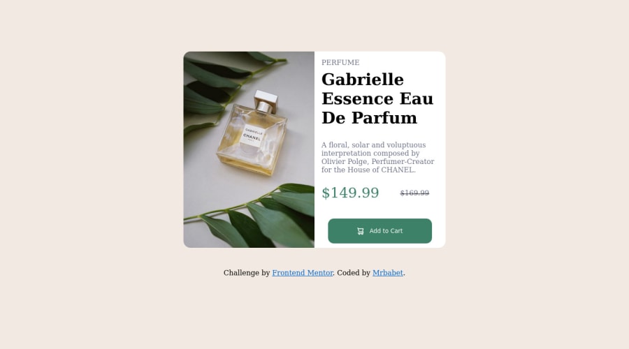
Design comparison
SolutionDesign
Solution retrospective
Please give me some feedback :)
Community feedback
- @correlucasPosted over 2 years ago
👾Hello Kamil, congratulations for your solution!
Your component is really good, but you've added some paddings that are creating a huge gap between the container and making the viewport grow. See the piece of code thats creating this error below:
@media screen and (min-width: 600px)
body {
    position: relative;
    /* margin-top: 30%; */
    /* padding-bottom: 30%; */
}
Hope it helps and happy coding!
Marked as helpful1
Please log in to post a comment
Log in with GitHubJoin our Discord community
Join thousands of Frontend Mentor community members taking the challenges, sharing resources, helping each other, and chatting about all things front-end!
Join our Discord
