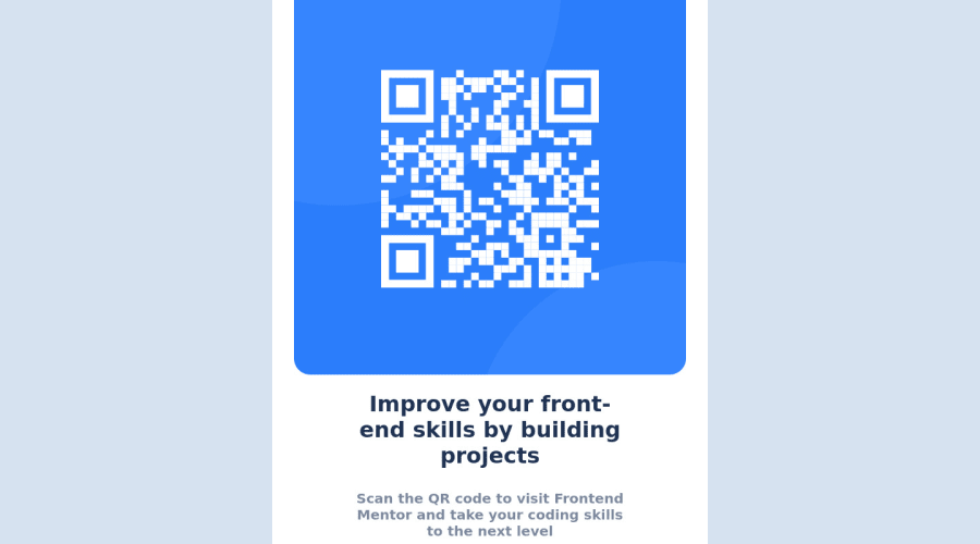
Design comparison
Solution retrospective
Please I will like to know if my code is responsive.
Community feedback
- @MelvinAguilarPosted almost 2 years ago
Hello 👋. Congratulation on successfully completing your first challenge 🎉 ! !
I have some recommendations regarding your code that I believe will be of great interest to you.
-
Use
min-height: 100vhinstead ofheight: 100vh. Theheightproperty can cause your component to be cut off on small screens, such as a mobile phone in landscape mode.Here is an image of how it would look on a mobile device (taking into account the scroll): screenshot-imgur
- In my opinion, the width of the component and the font-size is too big, which makes it not look good on mobile devices.
I hope you find it useful! 😄 Above all, the solution you submitted is great!
Happy coding!
Marked as helpful1@Denaro13Posted almost 2 years ago@MelvinAguilar I really appreciate your feedback. Thanks so much
1 -
Please log in to post a comment
Log in with GitHubJoin our Discord community
Join thousands of Frontend Mentor community members taking the challenges, sharing resources, helping each other, and chatting about all things front-end!
Join our Discord
