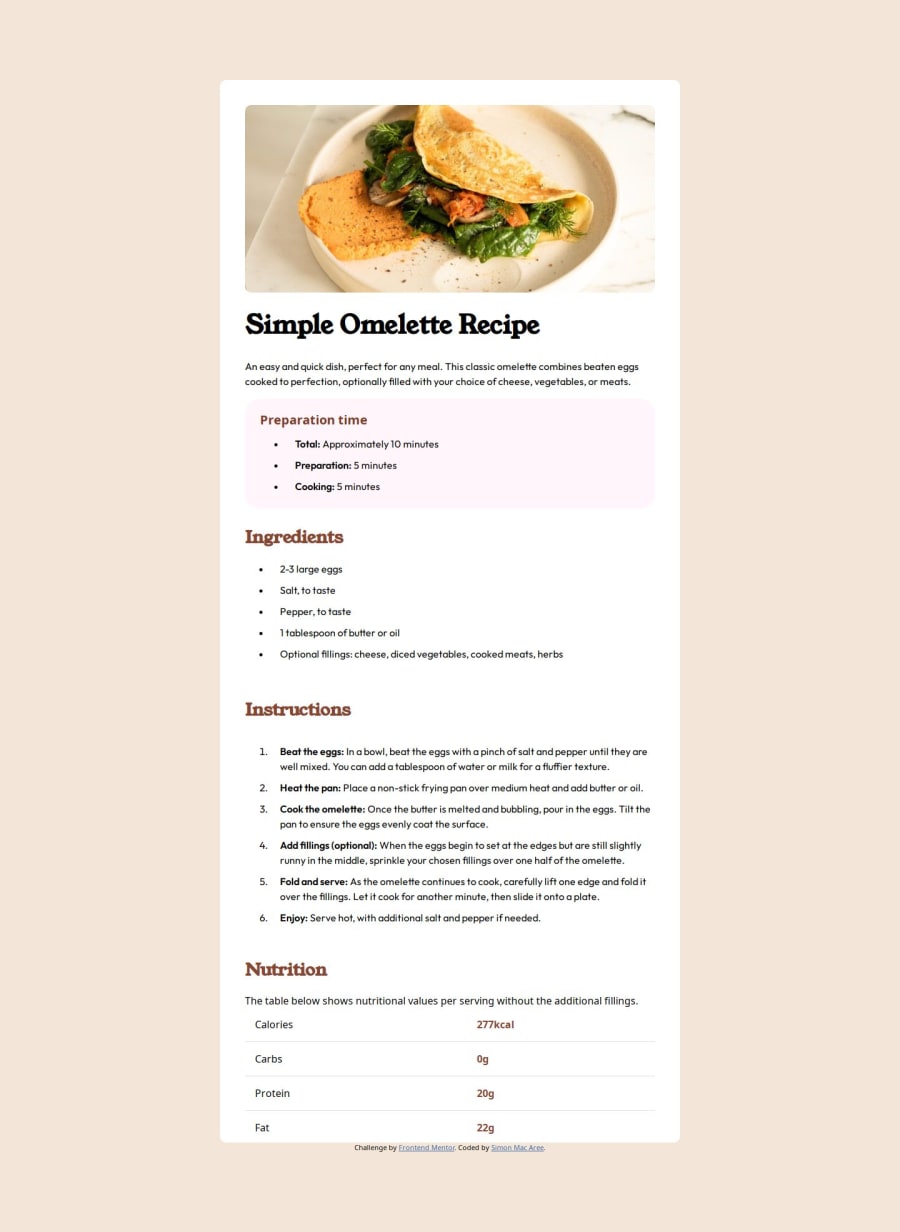
Design comparison
SolutionDesign
Community feedback
- @chilldeleuzePosted 5 months ago
The overall layout looks good, but there's a few minor details that are missing.
- the table seems to be using a different font
- the list icons are using a different color
- the numbers in the ordered list aren't bolded
Instead of
<span class="text-bold">you could have usedstronginstead, which I think is more semantic?When working with lists, when you want to increase the gap between the list items, you can use a sibling selector (
li + li). So instead of.points{ padding: 0 0 10px 16px; } .last-point { padding: 0 0 0 16px }you could do:
li {
padding-left: 16px
}

li + li {
padding-bottom: 10px
}
hope this helps :)
Marked as helpful0
Please log in to post a comment
Log in with GitHubJoin our Discord community
Join thousands of Frontend Mentor community members taking the challenges, sharing resources, helping each other, and chatting about all things front-end!
Join our Discord
