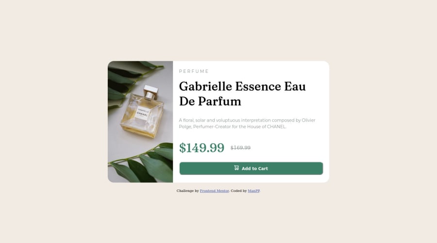


Design comparison

Solution retrospective
-Have a lot of problems with sizing issues. -Cannot adjust a paragraph like an example, which i think was because varieties of mobiles screen size -Still not sure the best approach in padding, margin especially for responsive web design
Community feedback
- @Chiemeka2006Posted over 2 years ago
@ManPP to also centralise the div container in the page u should add the property display grid to the body also give the body a min-height: 100vh; and then set the container to margin auto and it should be centralized in the center of the pagee. hope it helps <£ ,3<3
Marked as helpful2 - @Hamid210545Posted over 2 years ago
@ManPP You have done an amazing job but let me know you that you have to center the card as per as the design ............ you can fix it by taking body { display:flex; justify-content: center; and align-items: center;}....... I hope this will fix your problem....... Thanks!
Marked as helpful0 - @PhoenixDev22Posted over 2 years ago
Hi ManPP,
Congratulation on completing another frontend mentor challenge. I have some suggestions regarding you solution if you don't mind:
- You should use
<main>to wrap the body main content ,<footer>for the attribution. Landmarks allow screen reader users to navigate through sections of your website by skipping to content that interests them. Landmarks could be seen as the logical layout of the website's UI, which is divided into e.g. header, navigation, main content, and footer. So the usage makes sense in any case.
- I recommend to use <picture> tag in HTML to specify image resources. The <picture> tag contains <source> and <img> tags. This way the browser can choose the image that best fits the current view and/or device. If you have a small screen or device, it is not necessary to load a large image file. The browser will use the first <source> element with matching attribute values, and ignore any of the following elements.
- A button with no type attribute acts as type=”submit”, and will attempt to submit form data when clicked. Be explicit in your intentions and kind to future developers working with your code: provide a type. By specifying either button, submit or reset, the code’s purpose is clear and is easier to maintain. In this challenge, it's more likely the button has type submit of a form <form>.
- In HTML, the <del> tag is used to identify text that has been deleted from a document but retained to show the history of modifications made to the document. Strike through is a CSS property and does not carry any semantic meaning as inserted or deleted for screen readers. For screen reader: <del> deleted indicates text removed. In this instance, the two prices are read out which can be confusing.
- In this challenge, the cart svg in the button is decorative. For any decorative svgs, each svg tag should have
aria-hidden="true"andfocusable=”false”attributes to make all web assistive technologies such as screen reader ignore those svgs .
- Adding
rel="noopener"orrel="noreferrer"totarget="_blank"links. When you link to a page on another site usingtarget=”_blank”attribute, you can expose your site to performance and security issues.
- You should use
object-fit: cover;to the image which sets how the image should be resized to fit its container.object-fit: cover;maintains its aspect ratio while filling the element's entire content box.
- Remember a modern css reset on every project that make all browsers display elements the same.
Overall, great work! Hopefully this feedback helps.
Marked as helpful0@WhitezerDPosted over 2 years ago@PhoenixDev22 Thanks for taking time to gave me a lot of feedback. I've learned a lot from your advice.
1@PhoenixDev22Posted over 2 years ago@WhitezerD
Glad to hear that it was helpful. Happy coding!
0 - You should use
- @Chiemeka2006Posted over 2 years ago
@ManPP why dont u make the image have a property of object-fit: cover, then u use object-fit-position to position the image at the center. Hope this helps. <£ <3<3
1@Chiemeka2006Posted over 2 years ago@WhitezerD You should also give the image a width of 505% sorry imeant 50% if u have specified the width of the container
0@WhitezerDPosted over 2 years ago@Chiemeka2006 I've already done it and it's work correctly in my browser and in Github live url. But i don't know why it's still seems wrong in the screenshot.
0 - @Hamid210545Posted over 2 years ago
@ManPP that's great it really looks good now ....... Keep improving like this...... Thanks for considering my comment... Thanks!
0


Please log in to post a comment
Log in with GitHub
Join our Discord community
Join thousands of Frontend Mentor community members taking the challenges, sharing resources, helping each other, and chatting about all things front-end!
Join our Discord