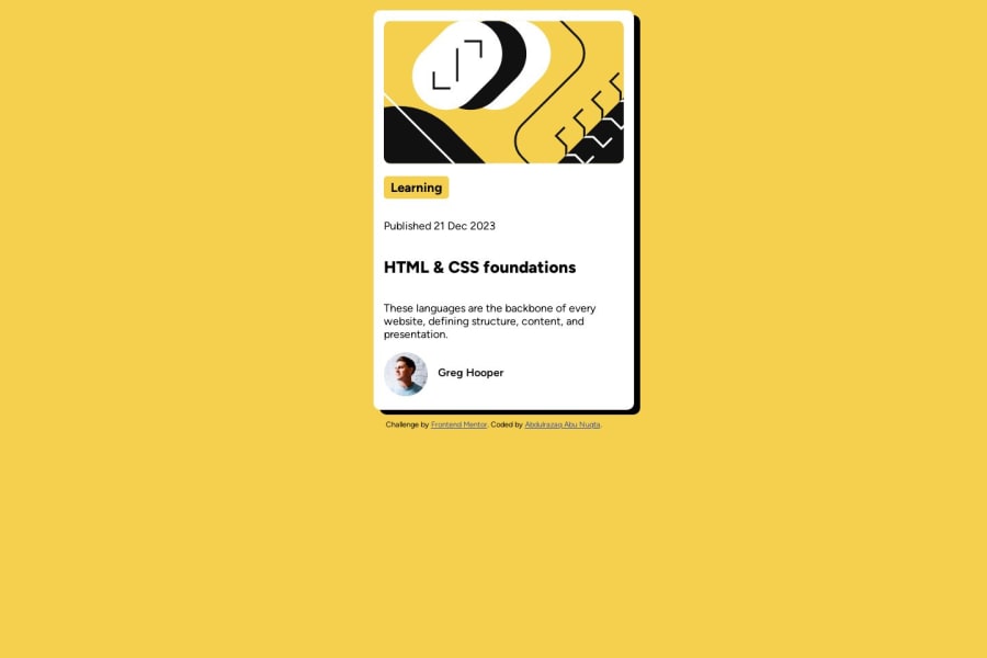
Design comparison
Solution retrospective
Solving problems and enhancing front-end development skills, BoxShadow ,Training on Flexbox,Designing HTML structure.
Community feedback
- @danielmrz-devPosted 10 months ago
Hello @Abdulrazaq-abunuqta!
Your solution looks excelent!
I have just one suggestion:
- In order to make your HTML code more semantic, use
<h1>for the main title instead of<h2>. Unlike what most people think, it's not just about the size and weight of the text.
📌 The
<h1>to<h6>tags are used to define HTML headings.📌
<h1>defines the most important heading.📌
<h6>defines the least important heading.📌 Only use one
<h1>per page - this should represent the main heading/title for the whole page. And don't skip heading levels - start with<h1>, then use<h2>, and so on.This change has little or not effect at all on the project, but it makes your HTML code more semantic, improving SEO optimization as well as the accessibility of your project.
I hope it helps!
Other than that, you did a great job!
Marked as helpful1@Abdulrazaq-abunuqtaPosted 10 months agoHello @danielmrz-dev ,
I sincerely appreciate your thoughtful feedback and the time you took to review my solution. Your suggestion regarding the use of <h1> for the main title instead of <h2> is insightful and shows your attention to semantic HTML.
I completely understand the importance of semantic structure for both SEO optimization and accessibility, and I'm grateful for your guidance on this matter. Your clear explanation of the significance of heading tags from <h1> to <h6> provides valuable insights for improving the overall quality of my HTML code.
I'll definitely implement your suggestion to enhance the semantic value of the code, and I'm grateful for the constructive feedback you provided. Your encouragement means a lot, and I'm glad to hear that you found the rest of the solution to be excellent.
Thank you once again for your valuable input and positive words. I truly appreciate it!
Best regards, Abdulrazaq Abu Nuqta
1@danielmrz-devPosted 10 months ago@Abdulrazaq-abunuqta
I'm glad I could help 😊
Marked as helpful0 - In order to make your HTML code more semantic, use
- @Marley-SemendePosted 10 months ago
Hi @Abdulrazaq-abunuqta. Nice work overall on your project. However you can make use of the align-items property to align items along the cross axis. This would center your card vertically. For example:
main {
min-height: 100vh;
align-items: center;
justify-content: center;
}
I hope this helps. happy coding :)
Marked as helpful0@Abdulrazaq-abunuqtaPosted 10 months agoThank you so much for your feedback, @Marley-Semende! I appreciate your kind words and the suggestion to use the align-items property. It really helped improve the vertical alignment of the card in my project. Your input is valuable!
0
Please log in to post a comment
Log in with GitHubJoin our Discord community
Join thousands of Frontend Mentor community members taking the challenges, sharing resources, helping each other, and chatting about all things front-end!
Join our Discord
