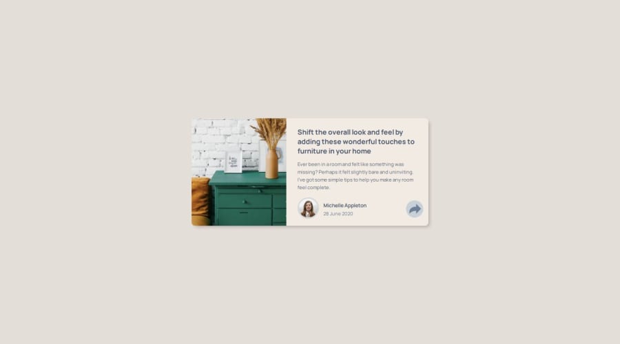
Not Found
Not Found
Not Found
Not Found
Not Found
Not Found
Not Found
Not Found
Not Found
Not Found
Not Found
Not Found
Not Found
Not Found
Not Found
Not Found
Not Found
Not Found
Not Found
Not Found

Submitted

HTML, CSS FLex, Grid, JS

P
Sam Hooker 410

@35degrees

Desktop design screenshot for the Article preview component coding challenge

This is a solution for...

  • HTML
  • CSS
  • JS
1newbie
View challenge

Design comparison


SolutionDesign

Solution retrospective


What are you most proud of, and what would you do differently next time?

mapped out the mobile width and media queries better. I got the mobile footer overlay done but I never could sync it with the arrow button. Also frustrated the tooltip doesn't load on first click, maybe I need to add another element over it that's transparent.

What challenges did you encounter, and how did you overcome them?

too much code, wrote many lines, ready to move on

Community feedback

@Saoud2021

Posted

Nice work on adding JavaScript to enhance the interactivity of your component! Let's break down what you've done and discuss some potential improvements:

  1. You're using DOMContentLoaded to ensure your script runs after the DOM is fully loaded. That's a good practice.

  2. You've set up click listeners for both desktop and mobile versions to toggle the display of the tooltip and mobile overlay. This is a good start!

  3. For the desktop version, you're toggling the tooltip visibility on click. That's working well.

  4. For the mobile version, you're showing the overlay and hiding the normal footer when clicked. That's a good approach.

Here are some suggestions to improve and expand on what you've done:

  1. Consider using classList.toggle() instead of directly manipulating style.display. It's often cleaner and allows for easier CSS transitions. For example:

    tooltip.classList.toggle('active');
    

    Then in your CSS, you can have:

    .tooltip {
      display: none;
    }
    .tooltip.active {
      display: block;
    }
    
  2. To make the tooltip appear on first click, you could initialize its display state in JavaScript:

    tooltip.style.display = 'none';
    
  3. For the mobile overlay, you might want to add functionality to close it as well:

    flexMobileOverlayButton.addEventListener('click', function() {
      footerMobileOverlay.style.display = 'none';
      flexFooterMobile.style.display = 'flex';
    });
    
  4. Consider adding a click event listener to the document to close the tooltip or overlay when clicking outside:

    document.addEventListener('click', function(event) {
      if (!flexButton.contains(event.target) && !tooltip.contains(event.target)) {
        tooltip.classList.remove('active');
      }
    });
    
  5. For smoother transitions, you could use CSS transitions and opacity instead of display:

    .tooltip {
      opacity: 0;
      transition: opacity 0.3s ease;
      pointer-events: none;
    }
    .tooltip.active {
      opacity: 1;
      pointer-events: auto;
    }
    

These changes should help make your interactive elements more responsive and user-friendly. Keep up the great work!

Marked as helpful

0

Please log in to post a comment

Log in with GitHub
Discord logo

Join our Discord community

Join thousands of Frontend Mentor community members taking the challenges, sharing resources, helping each other, and chatting about all things front-end!

Join our Discord