HTML CSS Flex box JavaScript

Solution retrospective
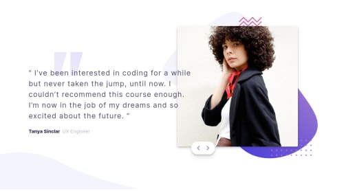
Hi while working on this project i faced the below issues . First one is where we need to overflow text on image so what i made the text content is fixed the width of text so it doesn't shrink and added z-index has 1 and image container i kept z-index has -1 add arrow container was wrapped in image i cudn't add cursor pointer or hover effect because z-index was negative so i create an other div to add arrow buttons. Second the responsiveness is not proper the text content expand as i move the screen bigger any suggestions on how to fix this?? Thanks
Please log in to post a comment
Log in with GitHubCommunity feedback
No feedback yet. Be the first to give feedback on shashank's solution.
Join our Discord community
Join thousands of Frontend Mentor community members taking the challenges, sharing resources, helping each other, and chatting about all things front-end!
Join our Discord