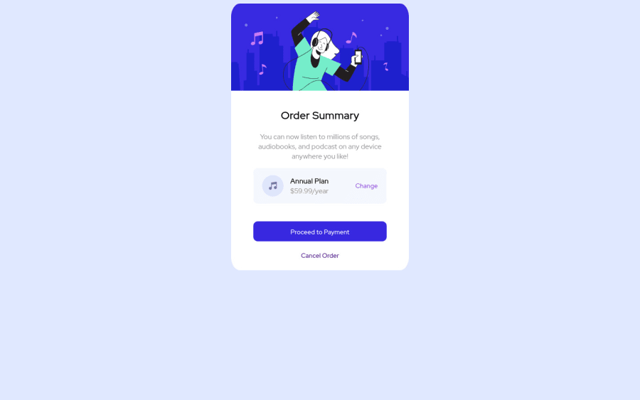
Design comparison
Solution retrospective
Feedback welcome
Community feedback
- Account deleted
Hello there! 👋
Congratulations on finishing your challenge! 🎉
I have some feedback on this solution:
- remove all the margin from the card element and give the body these properties to center the element
display:flex justifiy-content:center align items: center min-height:100vh - check the HTML report to fix accessiblity issues
i hope this is helpful and goodluck!
Marked as helpful1 - remove all the margin from the card element and give the body these properties to center the element
- @denieldenPosted about 3 years ago
Hi Juan, great work on this challenge! 😉
Here are a few tips for improve your code:
- For add the top image in the background just put more specific background properties to the body:
background: url("../img/pattern-background-desktop.svg") no-repeat top center; background-size: contain; background-color: #e0e8ff;- add
maintag and wrap the card for improve the Accessibility - use
buttonelement insteadafor the Payment button - instead of using
pxuse relative units of measurement likerem-> read here
Overall you did well 😁 Hope this help!
1 - @Kl3vaPosted about 3 years ago
Hi Juan, You should remove the overflow: hidden... On certain viewport heights, I can't view the button and footer.
0
Please log in to post a comment
Log in with GitHubJoin our Discord community
Join thousands of Frontend Mentor community members taking the challenges, sharing resources, helping each other, and chatting about all things front-end!
Join our Discord
