Design comparison
Solution retrospective
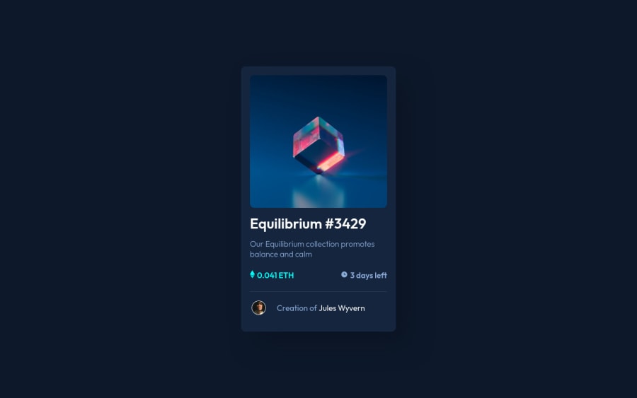
This is my second challenge. The hovering part , I tried to keep it in simple css.
"transform: translate(-50%, -50%); -ms-transform: translate(-50%, -50%);" --- this one I saw but I tried to use the basic css for the hovering part because I am a beginner and didn't fully understood the "transform" part. I am learning the transform now.
It will be kind of you guys to share your opinion.
Community feedback
- @MilleusPosted over 2 years ago
Greetings,
Congratulations on completing your second challenge!
transform: translate(-50%, -50%);means to move an element to the left by 50% of the current width of the element, and also up by 50% of the current height of the element.This is typically paired with
position: absolute; top: 50%; left:50%;to center the element horizontally and vertically. For example,.parent { position: relative; } .child { position: absolute; top: 50%; left: 50%; transform: translate(-50%, -50%); }You can read more about this under "Is the element of unknown width and height?" at centering css complete guide.
You can also try adding the position absolute and translate code snippet to your eye image and see it works :)
I would also suggest looking into using <button> or <a> for interactive elements as it would improve the accessibility of your solution.
I hope this was helpful for you, happy coding~
Marked as helpful0
Please log in to post a comment
Log in with GitHubJoin our Discord community
Join thousands of Frontend Mentor community members taking the challenges, sharing resources, helping each other, and chatting about all things front-end!
Join our Discord
