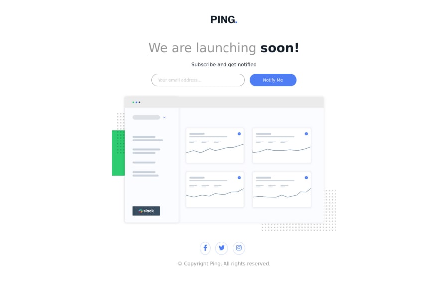
Design comparison
Solution retrospective
Qualquer feedback, será bem vindo.
Community feedback
- @A-amonPosted over 3 years ago
Hello! Great work~ It has good responsiveness.
I have a few suggestions (I think?)
-
The logo image should be wrapped by an a tag that links to the homepage.
-
I am not sure about putting the heading till the form elements in the header but this is just my preference, I guess.
-
Putting the section in a main tag should remove some of the accessibility issues in the report.
-
Have an aria-label attribute in your a tags for footer. https://www.w3.org/WAI/WCAG21/Techniques/aria/ARIA8.html#:~:text=The%20aria%2Dlabel%20attribute%20provides,used%20instead%20of%20aria%2Dlabel%20.
-
Instead of setting the styles directly in JS, add/remove class instead. E.g. add .success class to show success-related styles.
-
I think there should be a label or aria-label for the input element.
Marked as helpful0 -
Please log in to post a comment
Log in with GitHubJoin our Discord community
Join thousands of Frontend Mentor community members taking the challenges, sharing resources, helping each other, and chatting about all things front-end!
Join our Discord
