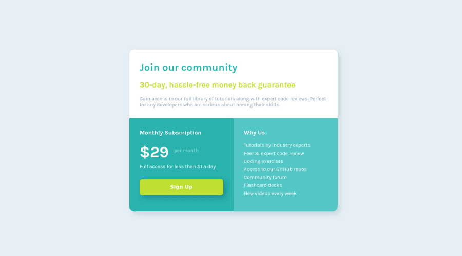
Design comparison
SolutionDesign
Solution retrospective
Things I had a hard time with:
- I don't know why there are scroll bars (both horizontal and vertical);
- Div's sizes when breaking the component into mobile screen;
Hope to get soe feedback.
Community feedback
- @Artur-NeriPosted over 2 years ago
Eai, Daniel!
Eu não sei quanto a ser correto ou não, mas colocando margin: 0 auto; no body{} já removeria as barras vertical e horizontal.
Marked as helpful1@dnlblumPosted over 2 years ago@Artur-Neri Thanks Arthur, your tip worked perfectly.
1 - @afaiz-spacePosted over 2 years ago
Hey @dnlblum,
- Remove
width: 100vw;and Replaceheight: 100vh;withmin-height: 100vh;in the body element. - Remove
margin: 0 30%;and Replace `min-width: 650px; with width: 40rem; in the main element.
1@dnlblumPosted over 2 years ago@afaiz-space Thank you Faizan. Did not fully understand why, but it also worked. Thanks.
0 - Remove
Please log in to post a comment
Log in with GitHubJoin our Discord community
Join thousands of Frontend Mentor community members taking the challenges, sharing resources, helping each other, and chatting about all things front-end!
Join our Discord
