Design comparison
Community feedback
- @zebozebo1Posted about 1 year ago
urtaga olib keling tepaga chiqib ketgan
Marked as helpful0 - @Ziynat02Posted about 1 year ago
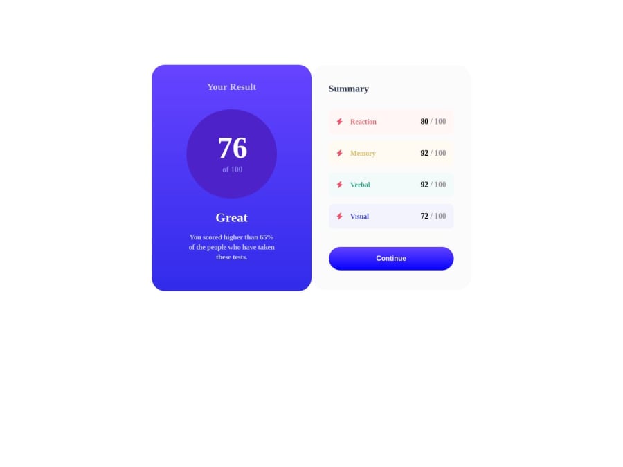
proekt o'rtaga kelmagan kelmagan aktiv holatidagi bilan oddiy turgan holati almashib qogan, iconkalari bir xil, o'shalarni to'g'irlang iloji bo'lsa
Marked as helpful0 - @muhammad-jonPosted about 1 year ago
change font family to :
sans-serifwrap
.cardsclass to div and then give style to this div:display: flex; align-items: center; justify-content : center; width: 100vw; height: 100vh; }for create
.circleusebackground linear gradientinstead ofbackground colorchange the icons
Marked as helpful0 - @webdev57Posted about 1 year ago
This message is for @gavharoyabdurahimova. Do not create fake accounts and write single line feedback to mark them as helpful in order to score more points. I have reported your account to the frontendmentor.io moderators. The same message applies to all the real/fake commentors on @gavharoyabdurahimova submissions. Follow the feedback posting guidelines and do not bring the community down to your level- https://medium.com/frontend-mentor/frontend-mentor-community-guidelines-44303cc38aa6
1
Please log in to post a comment
Log in with GitHubJoin our Discord community
Join thousands of Frontend Mentor community members taking the challenges, sharing resources, helping each other, and chatting about all things front-end!
Join our Discord
