html, css, css variables, basic javascript
Design comparison
Solution retrospective
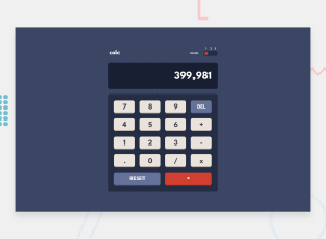
The main Issue there currently is, is that you have to click the numbers to toggle the theme, rather than in the highlighted row. Simple suggestions to fix this are welcome :)
Community feedback
- @RahulKumarGautam1636Posted over 3 years ago
Nice work, Design looks good but not working. the challenge was to build a working calculator. I've done this one, take a look on it to get to know what's the final produnct is supposed to be. For toggle bar, you can put three span or divs with onclick inside the togglebar container instead of putting onclick on numbers.
Marked as helpful1 - @ChamuMutezvaPosted over 3 years ago
Your github link is not working. What other Frontend Mentor challenges have you done?
0@jordyjordyPosted over 3 years ago@ChamuMutezva Thank you for noticing! I had forgotten to make the repository public. It should be visible now.
I have also done the 3-column preview card component challenge
0 - @jordyjordyPosted over 3 years ago
Thank for the feedback! I had not read through the assignment properly, I'll turn it into a working calculator in a bit! For the toggle bar i am using a custom "radio" so I'll have to look at how I can make sure it is always clickable then
0
Please log in to post a comment
Log in with GitHubJoin our Discord community
Join thousands of Frontend Mentor community members taking the challenges, sharing resources, helping each other, and chatting about all things front-end!
Join our Discord
