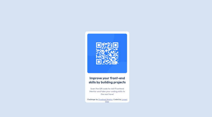
Design comparison
Solution retrospective
-What did you find difficult while building the project? Grid took me a while.
-Which areas of your code are you unsure of? Grid again, i think it wasn´t a good coding even when i finished it.
Community feedback
- @correlucasPosted over 2 years ago
👾Hello @leonellv94, congratulations for your new solution!
Remove all margins and do the alignment using the
bodywithmin-height: 100vhand flex properties. Note that you don't need to usewidth: 1440pxis only a reference for the size the design was created.Here's the changes I did to your code:
body {
    min-height: 100vh;
    /* width: 1440px; */
    background-color: hsl(212, 45%, 89%);
    display: flex;
    align-items: center;
    justify-content: center;
}

.boxA {
    display: grid;
    /* width: 1440px; */
    /* height: 900px; */
    justify-content: center;
    align-content: center;
}
✌️ I hope this helps you and happy coding!
Marked as helpful1 - @PhoenixDev22Posted over 2 years ago
Hi Leonel,
Congratulation on completing this challenge. Your solution looks great. I have some suggestions regarding your solution if you don’t mind:
- Use the
<main>landmark for the card and<footer>for the attribution, it should live outside the<main>.
- In my opinion, the alternate text should indicate where the Qr code navigate the user : like
QR code to frontend mentor.
- Never use
<div>and<span>alone to wrap a meaningful content. Just keep in mind that you should usually use semantic HTML in place of the div tag unless none of them (the semantic tags) really match the content to group together. By adding semantic tags to your document, you provide additional information about the document, which aids in communication.
So to tackle the accessibility issue in this challenge, you can <h1> for the
class="text1". And you can use<p>forclass="text2".- Adding
rel="noopener"orrel="noreferrer"totarget="_blank"links. When you link to a page on another site usingtarget=”_blank”attribute, you can expose your site to performance and security issues.
width: 300pxan explicit width is not a good way to have a responsive layout. Consider usingmax-widthto the card inreminstead.
- Consider using
remfor font size .If your web content font sizes are set in absolute units, such as pixels, the user will not be able to re-size the text or control the font size based on their needs. Relative units “stretch” according to the screen size and/or user’s preferred font size, and work on a large range of devices.
Hopefully this feedback helps.
Marked as helpful1 - Use the
- @DavidMorgadePosted over 2 years ago
Hello Leonel, congrats on finishing the challenge!, great job as a first project
Don't first overwhelmed with grid and flex-box, time will improve your skills and you will se how you will get much better at it, here is my little recommendation to get better at flex and grid.
First of all there is a vid from, Kevin Powell that gives a nice introduction to Grid, take a look at it! its really worth it. You should also checkout two games that can help you with flex and grid, this are flex-box-froggy and grid-garden, try them, they are good material to improve at those particular css properties!
Hope my feedback helps you! I encourage you try more challenges and keep going with the practice, good job.
Marked as helpful1 - @tesla-ambassadorPosted over 2 years ago
Hey Leonel! Great solution it's looking pretty sharp 👌 I took a peek at your code and it's actually neat, don't beat up yourself too much on that. I also had a hard time writting proper css when I started out. It gets better with more and more practice. Also I like how you are using grid for your layouts, you are among the rare breed 😎
- In anycase, if you prefer using grid for your layouts, it's better you apply it to the parent container and then you use flex for the container's contents. To learn more about grid and how to use it, you might want to check this out css grid.
- In order to resolve some of your accessibility issues, you might wanna use landmarks in your html code, these help browsers easily navigate your code. So you might consider wrapping your divs in landmarks like
<main>or<header>or<footer>you need to do this according to how your page is structured. Incase you want to know more about landmarks, follow this link. - You might also want to add a little bottom-padding to your div with the class
attributionso that it's not so much at the bottom border. It'll make the solution look a little neater. Keep up the great work and keep on coding!😎
Marked as helpful1
Please log in to post a comment
Log in with GitHubJoin our Discord community
Join thousands of Frontend Mentor community members taking the challenges, sharing resources, helping each other, and chatting about all things front-end!
Join our Discord
