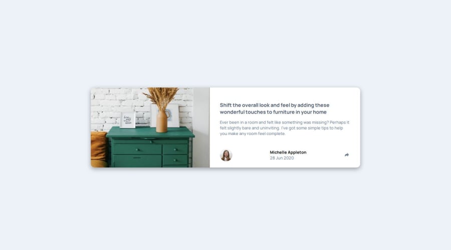
Design comparison
Solution retrospective
It's working fine on 1920 x 1080 and browser scale of 100%, but everything is on mess when scale changes. also it was quite challenging because desktop version has different action on share button. mobile version was really easy, it was working well but after changes it has same behavior as desktop because of transform: transition(), is there any advice?
Community feedback
- @AshongAbdallah06Posted 8 months ago
Wrap the code in a
mainelement. Remove thedisplay: flex; justify-content: center; align-items: center;on the body and put on themain. And set theflex-direction: column. This way, you can just flip it toflex-direction: rowfor the desktop UI.You can check out mine for reference. Happy coding🎉
Marked as helpful0
Please log in to post a comment
Log in with GitHubJoin our Discord community
Join thousands of Frontend Mentor community members taking the challenges, sharing resources, helping each other, and chatting about all things front-end!
Join our Discord
