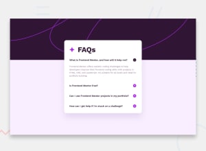
Design comparison
SolutionDesign
Solution retrospective
It was quite exciting.
Community feedback
- @YahiaGPosted 8 months ago
Hi VakhoCloud, Nice work there. I'd like to give some notes
- take a look on stylesheet attached with design, it has colors and fonts used
- No need for border bottom at the last question.
- you need to use event click on the question itself not the plus or minus icon
I hope my comment be useful for you, keep going my friend...
Marked as helpful0
Please log in to post a comment
Log in with GitHubJoin our Discord community
Join thousands of Frontend Mentor community members taking the challenges, sharing resources, helping each other, and chatting about all things front-end!
Join our Discord
