Design comparison
SolutionDesign
Solution retrospective
Any tips or suggestions for improvement? I know the code is a little messy, I only used CSS and went through a bit more trial and error than usual. Criticism is welcome
Community feedback
- @afrusselPosted over 3 years ago
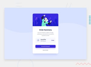
Make the box area bit wider. Other wise everything is good
Marked as helpful3 - @ChamuMutezvaPosted over 3 years ago
some issues have been raised in the report that needs fixing, they may include the following:
- the
mainelement is expected to be present in a site. Consider changing the div with a class ofbginto amainelement. - also considered important is a
h1heading element. Headings should ascend in order h1, h2, h3 etc without skipping headings. - an inline element like a span cannot be used as a parent of a block element , see example below. Either use a div instead of the span
<span class="an-plan">
        <p><h4>Annual Plan</h4></p> // this is not allowed
        <p>$59.99/year</p>
      </span>
Marked as helpful1@DxnielXndrewPosted over 3 years ago@ChamuMutezva Thank you. You've taught me some new things. I appreciate the input
0 - the
- @surigaoadrianPosted over 3 years ago
The cta button doesnt have box-shadows and its bg color is purple rather than blue. You should also put line-height and padding to your texts. Otherwise everything is fine
Marked as helpful1
Please log in to post a comment
Log in with GitHubJoin our Discord community
Join thousands of Frontend Mentor community members taking the challenges, sharing resources, helping each other, and chatting about all things front-end!
Join our Discord
