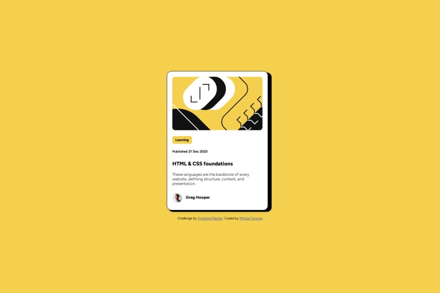
Design comparison
Solution retrospective
I will deepen the fundamental skills of frontend, namely HTML, CSS and JS
What challenges did you encounter, and how did you overcome them?Maybe what is different from previous projects in this project is the hover text background
What specific areas of your project would you like help with?maybe is hover text background
Community feedback
- @abhi-zeroPosted 6 months ago
I would like to ask why your text appears bold, whereas mine does not. Could this be due to my use of @font-face? If you know, could you please explain how to fix it?
Marked as helpful0 - @rafirachmawanPosted 6 months ago
Thank you for the question, maybe if I had mine I would have used CSS like this "font-size: 17px; font weight: 800; padding-top: 10px;" might help
0
Please log in to post a comment
Log in with GitHubJoin our Discord community
Join thousands of Frontend Mentor community members taking the challenges, sharing resources, helping each other, and chatting about all things front-end!
Join our Discord
