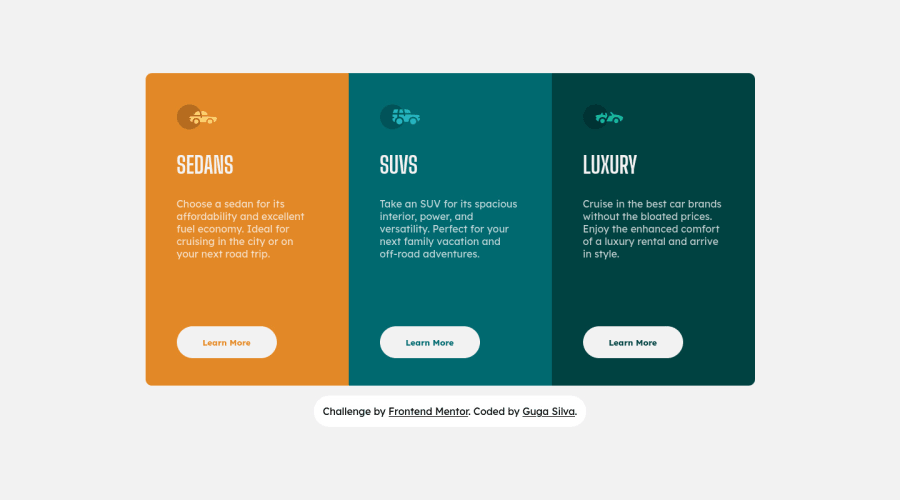
Design comparison
Solution retrospective
what did you think? please tell me. ☕👌🏻
Community feedback
- @SamadeenPosted almost 3 years ago
Hey!! Cheers 🥂 on completing this challenge.. .
Here are my suggestions..
- You should use <main class="card-container"> instead of <div class="card-container">.
- Go down orderly when you are using the headings h1 down to h2 down to h3 and so on.
This should fix most of your accessibility issues
. Regardless you did amazing... hope you find this useful... Happy coding!!!
Marked as helpful1@GugaS1lvaPosted almost 3 years ago@Samadeen Beautiful conditions. I had forgotten to use 'main' in this project 😅 His notes were very helpful, thank you friend.
0 - @archisvazePosted almost 3 years ago
Looks great! you should add line height in css for the spacing between the line and adjust the font a little bit, but other that looks identical! good job man!
Marked as helpful1@GugaS1lvaPosted almost 3 years ago@archisvaze Thank you very much. I tried hard but there is always something to learn. Thanks for your help ^^
0
Please log in to post a comment
Log in with GitHubJoin our Discord community
Join thousands of Frontend Mentor community members taking the challenges, sharing resources, helping each other, and chatting about all things front-end!
Join our Discord
