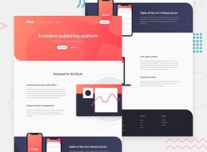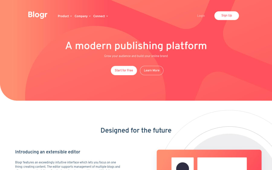
Design comparison
SolutionDesign
Solution retrospective
First use of Bootstrap. Took many hours to complete.
Still busy with touch ups. It's about 90% complete. All feedback is welcome.
Community feedback
- @TiasstiassPosted about 3 years ago
Good job! 👏
Tested it on Safari iOS, looks good overall although:
- Centering is kinda off on first and third section,
- The hamburger menu’s items breaks on landscape mode
Now about the code:
- The use of !important is not recommended, if you need it that much, surely something is wrong with your code and using it shouldn’t be your first resort,
- 5 media queries are too much, look for ways to make it more responsive « on its own » like grid, responsive font-sizes with the use of clamp(), not setting fixed sizes, using em and rem etc..
Keep up the good work 💪
Marked as helpful2
Please log in to post a comment
Log in with GitHubJoin our Discord community
Join thousands of Frontend Mentor community members taking the challenges, sharing resources, helping each other, and chatting about all things front-end!
Join our Discord