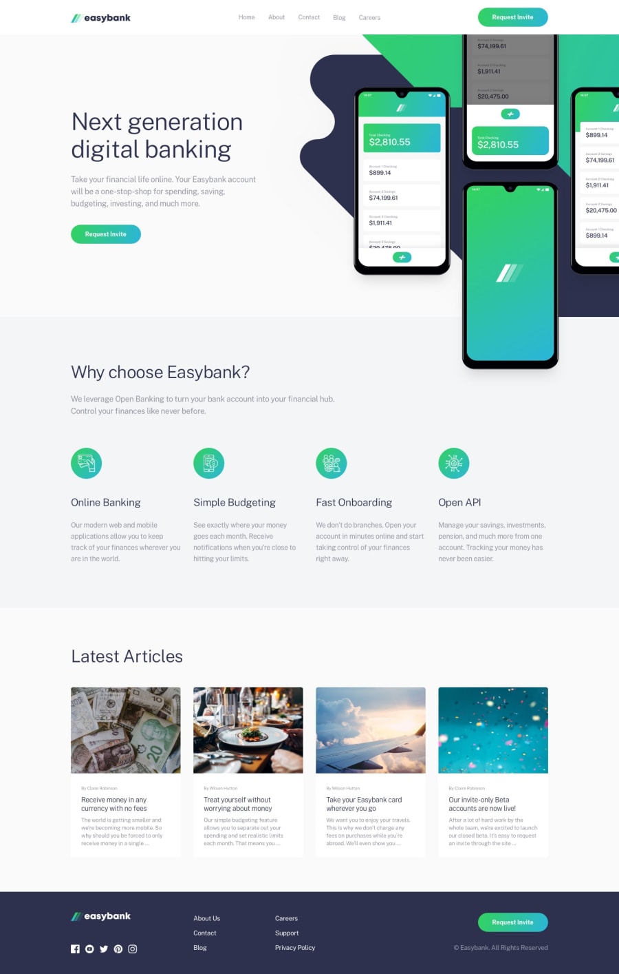
Design comparison
SolutionDesign
Solution retrospective
Any feedback will be appreciated! :)
Community feedback
- @adarshcodesPosted over 4 years ago
Hey! @Shahmir Faisal, Good work on this solution👍. Let's take a look at your solution from a few aspects
- Design aspect
- Your design looks pretty fine but needs few modifications like your design is missing the shadows of the last four cards.
- The hovering effect over the links is nice.
- Responsiveness aspect
- Responsiveness works fine.
- Like the way, the menu appears on clicking on hamburger icon😍.
- Code aspect
- Your code is fine and easy to relate to your CSS with your HTML.
- Issues aroused
- You can solve your HTML issue🙂
1
Please log in to post a comment
Log in with GitHubJoin our Discord community
Join thousands of Frontend Mentor community members taking the challenges, sharing resources, helping each other, and chatting about all things front-end!
Join our Discord
