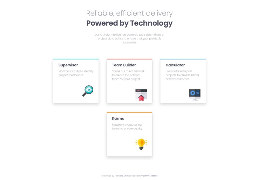
Design comparison
Solution retrospective
Hi! When i positioned the cards from left and right, i used margin-top CSS property. But when i resize the browser to smaller width, so it is matching the mobile width, the "margin-top" property remains the same of those cards, so they are not aligned properly on the mobile size. The only solution i could think of is creating class "shifted" with margin-top property, and assigning it to the side cards using javascript, checking the width of the "body" element.
If somebody managed to complete the challenge without using javascript, please let me know! Thanx in advance!=)
Community feedback
- @argelomnesPosted almost 5 years ago
Hey Vlad,
Definitely check out the link Declan provided. You'll need it for your
.shiftedclass. (desktop design) I suggest widening.cardsa little more so the cards aren't compressed. Since you're using Bootstrap it would be better if you use their class(es) for the following: To center them, you'll need to remove your margin declarations in Supervisor and Calculator cards except formargin: auto. And then set their parent container to flex.1 - @declanslevinPosted almost 5 years ago
Also, I would recommend you use the
positionproperty rather thanmargin-topto help with your positioning.You can set the parent container for a card to
position: relative, then set the card itself toposition: absolute. Then using thetopproperty you can control how the card will be positioned relative to the parent container.I hope that makes sense, and I'm happy to answer any questions you might have about positioning in this way.
Alternatively, you can also use Flexbox and CSS Grid for positioning, but I would recommend you learn as much as you can about
positionfirst before moving onto those :)1 - @declanslevinPosted almost 5 years ago
Hi Vlad,
I suggest you take a look at CSS media queries (e.g.
@media ( min-width: 376px ) {})- these will allow you to set different CSS property values depending on the screen width. When rules are set within a media query, they will only be applied once the condition is met. So in the example above, any CSS rules set within the query will only be applied when the screen width is above 375px in width.1
Please log in to post a comment
Log in with GitHubJoin our Discord community
Join thousands of Frontend Mentor community members taking the challenges, sharing resources, helping each other, and chatting about all things front-end!
Join our Discord
