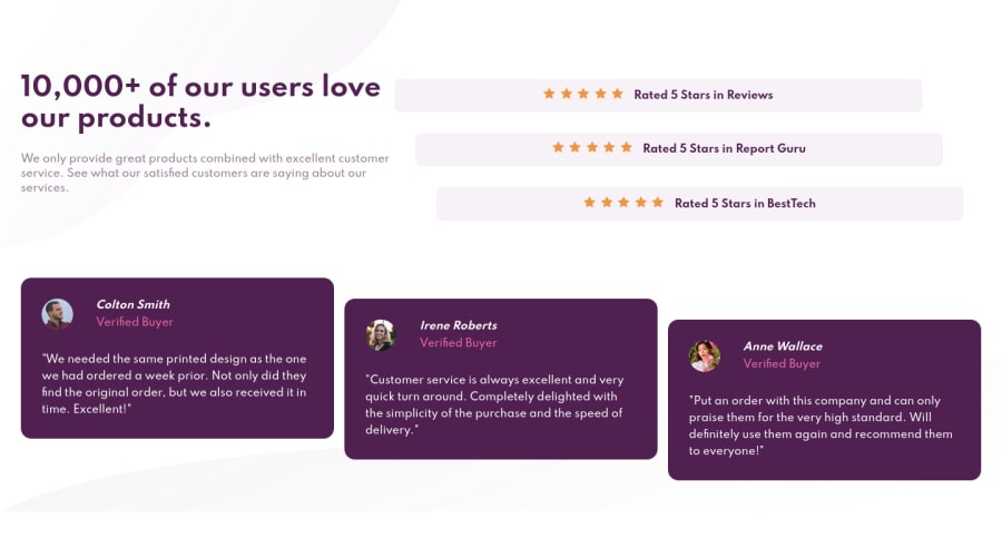
Design comparison
Solution retrospective
- I tried to use Grid on a container that had nested elements. For example, if I have the following markup:
<body>
  <header>Header</header>
  <main>
    <section class="section_1">Lorem, ipsum....</section>
    <section class="section_2">Lorem, ipsum....</section>
  </main>
</body>
and I have set display: grid; on <body>, is it possible to have the header and the two sections as grid items, essentially "ignoring" the <main> element?
- I tried to time myself for this challenge. What would be a reasonable amount of time needed to complete this mini-challenge from start to finish for a professional frontend developer?
Community feedback
- @markup-mitchellPosted over 3 years ago
I've seen lots of people focusing on speed of execution for FEM challenges and I don't think it's a good thing to worry about when you're learning.
This phrase "from start to finish" is what makes it a difficult question to answer.
As a professional developer it'll probably be rare to start a brand new project from scratch. You won't have to figure out what font to use, or what base styles, or page-level layout, tooling, naming scheme - maybe even component patterns. So what does "start" mean?
"Finish" is just as tricky. You have accessibility and HTML issues in your FEM report, so is this challenge finished? Have you tested it across different browsers?
lol I expect you'll unfollow me after advice like this! 😜
TL;DR - this solution looks pretty robust and responsive, and I like how it adapts to tablet sizes. I can see you making efforts with the semantic HTML, which is great, and there are some quick fixes you could make in that department. Focus on quality rather than speed - the speed comes with practice.
0
Please log in to post a comment
Log in with GitHubJoin our Discord community
Join thousands of Frontend Mentor community members taking the challenges, sharing resources, helping each other, and chatting about all things front-end!
Join our Discord
