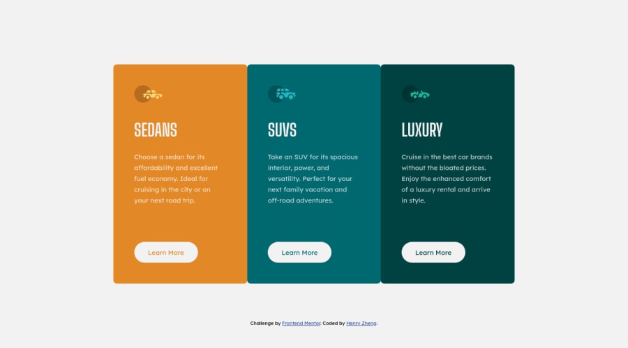
Design comparison
SolutionDesign
Solution retrospective
Any feedback would be appreciated😊
Community feedback
- @kens-visualsPosted about 3 years ago
Hey @LonelyBuddy 👋🏻
I have some suggestion for the project.
- First, instead of separately giving
border-radiusto each card, you can do the following:
main { border-radius: 0.5rem; overflow: hidden; }- For the car icons, add
aria-hidden="true”, because they're for decoration. You can read more aboutaria-hiddenhere. - Also, I suggest adding
transition: all 0.2s;to the button and the links, this will make:hoversmoother.
I hope this was helpful 👨🏻💻 overall, you did a great job, well done. Cheers 👾
Marked as helpful1@LonelyBuddyPosted about 3 years ago@kens-visuals Thanks for the feedback! The transition on buttons really makes the difference 😁.
0 - First, instead of separately giving
Please log in to post a comment
Log in with GitHubJoin our Discord community
Join thousands of Frontend Mentor community members taking the challenges, sharing resources, helping each other, and chatting about all things front-end!
Join our Discord
