Design comparison
Solution retrospective
As this is one of my first project with this much JS, I want know how can I optimize my current code.
Community feedback
- @palgrammingPosted over 3 years ago
It looks like you got a very good start to this challenge
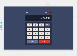
On the blue color mode you need to check the colors used cause the CALC text and the mode # 1 2 3 are disappearing into the background
It would also be nice to have a hover state on your buttons
But you have a very good start to this challenge
1 - @ApplePieGiraffePosted over 3 years ago
Hi there, BHARAT! 👋
Well done on this challenge! 👍 Your solution looks nice and seems to be working pretty well! 😀
One other small thing I might suggest is to make the toggle-switch keyboard-accessible so that it can be navigated to and used with the keyboard, as well. 😉
Keep coding (and happy coding, too)! 😁
0
Please log in to post a comment
Log in with GitHubJoin our Discord community
Join thousands of Frontend Mentor community members taking the challenges, sharing resources, helping each other, and chatting about all things front-end!
Join our Discord
