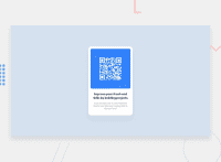
Design comparison
SolutionDesign
Solution retrospective
What are you most proud of, and what would you do differently next time?
I am proud of been able to make style the responsive landing
What challenges did you encounter, and how did you overcome them?I had slight challenge to centralize the elements but successfully achieved this flexing and aligning items in the center
What specific areas of your project would you like help with?I will like more help with centralizing elements
Community feedback
- @RahexxPosted 4 days ago
Great job with the first challange! Using flexbox as you did is great idea. You can center stuff using
display: flex,justify-content: center,align-items: centerthen you should have center stuff even forflex-direction: rowandflex-directions: column.You can try also this way, but using flex is better.
position: absolute;
top: 50%;
left: 50%;
transform: translate(-50%, -50%);
Marked as helpful0
Please log in to post a comment
Log in with GitHubJoin our Discord community
Join thousands of Frontend Mentor community members taking the challenges, sharing resources, helping each other, and chatting about all things front-end!
Join our Discord

