Design comparison
SolutionDesign
Solution retrospective
Any feedback is appreciated
Community feedback
- @pikapikamartPosted about 3 years ago
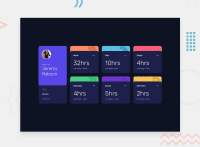
Hey, great work on this one. Layout in desktop is really good, though it is not really responsive. Not responsive is sense of, the layout doesn't size doesn't change when screen-size changes, you just transition it to mobile layout. Also the breakpoint is too early for mobile layout, the mobile layout takes form in about 1150+px which is too large for mobile, desktop layout could have used more of those. Though the mobile layout is good as well.
Some suggestions would be:
- You don't need to explicitly state the
widthon themainelement, since you are using agridon it and you are using the gtc orgrid-template-columnswith explicit column-width on it. Let the grid-template-columns shape the container. - The
altfor theimgof the person should have used its name as the value likealt="Jeremy Robson", if you are using a person's image, and their name is present, make it as thealtvalue. - The name of the person as well the the word
report foris not really suited to be ah1. On this one, theh1would only be a screen-reader only heading tag, it will havesr-onlyclass on it. Though the person's name will still be a heading, just noth1. - You don't have to use
sectionfor each cards, because each card are related components, if you were to usesectionuse it as a parent of those card, because it will be a "section" of information. - Each card title like "work", "play" should be a heading tag, because it gives the overview of what each card would be, hence "work" information, "play" information.
- The
altfor the ellipsisimgshould have been left empty likealt="", since it is just decoration, you don't need to addalton it. - Using
ptag on the selection on the bottom-left is not really good, it's functionality is limited to mouse users, but for keyboard and screen-reader users, they won't be able to toggle it since you are not using an interactive element. On this one, I suggest to useinput type="radio"since those are selections and radio buttons are intended for it.
Other than those, great work on this again.
Marked as helpful0 - You don't need to explicitly state the
Please log in to post a comment
Log in with GitHubJoin our Discord community
Join thousands of Frontend Mentor community members taking the challenges, sharing resources, helping each other, and chatting about all things front-end!
Join our Discord

