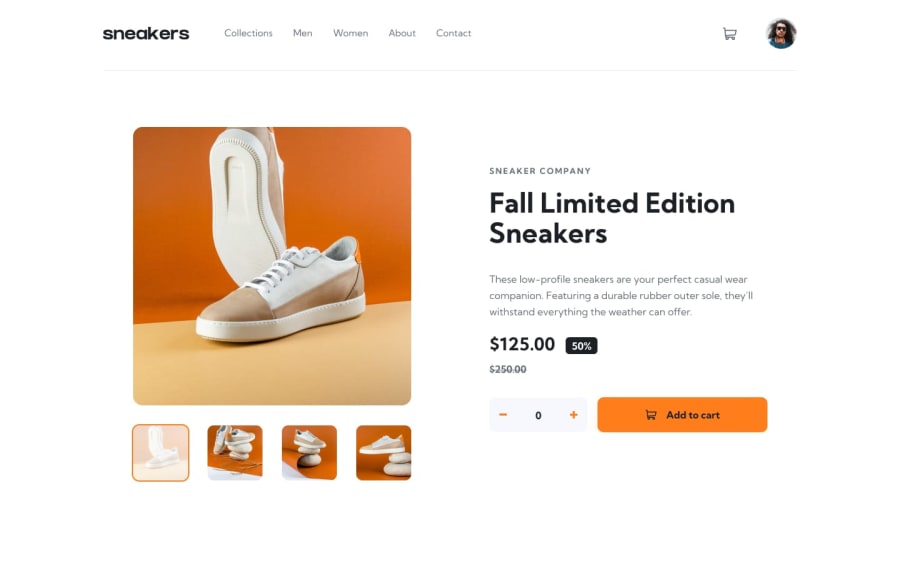
HTML, CSS and JS based solution for ecommerce-product-page
Design comparison
Solution retrospective
Hi people, this is my solution to ecommerce-product-page. Please provide your feedbacks.
Community feedback
- @Nam-HaiPosted almost 3 years ago
There is a lot that could be said but I'll try to focus on the most important.
Import the font used in the original design, it is specified in the style-guide.md provided with the design folder. (Use the google font import which is very simple).
Try to use flexbox the most efficient way. Flexbox is a very VERY powerfull tool. For exemple, for the main section, you should have use flexbox property on the
.productdivjustify-content: space-betweenand not set margin to.product-detaildiv. Best advice would be to practice Flexbox, for exemple there is the website https://flexboxfroggy.com/#en which is great for that.I also suggest you to start with easier challenge on Frontend mentor, as it is clear that you have a lot more to learn before starting to do bigger project. Small project are great to see quickly multiple things to work and not being overwhelmed.
Continue to work and you'll be fire !
0
Please log in to post a comment
Log in with GitHubJoin our Discord community
Join thousands of Frontend Mentor community members taking the challenges, sharing resources, helping each other, and chatting about all things front-end!
Join our Discord
