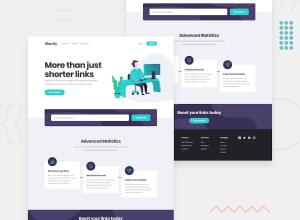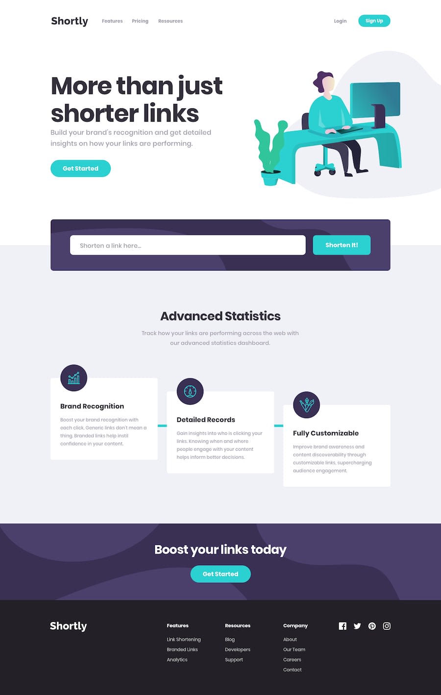
Design comparison
SolutionDesign
Solution retrospective
This one was a little more challenging to make responsive, so any constructive criticism is welcome.
Community feedback
- @mattstuddertPosted almost 5 years ago
Hey Matthew, nice work on this challenge! Sorry that it's taken me a little while to take a look at it. You've done a really good job 👍
Here are a few pointers after taking a look at your code:
- You're switching naming conventions for your CSS classes. For example, you've got
.nav-right-sideand also.hashNewURL. Is there a reason for this? I'd recommend sticking to "Kebab Case" with all letters lowercase and hyphens separating the words for CSS. - I recommend avoiding IDs for styling purposes. They're too specific and can't be reused on the page. Instead, stick to class, attribute, pseudo, and type selectors. It will keep your CSS much easier to manage, especially on larger projects.
- You're currently using
max-widthmedia queries. I'd recommend trying to use onlymin-widthqueries in a future project. You typically end up with less CSS code and it has the benefit of loading in fewer styles for mobile users.
Let me know if you have any questions!
1@MasterBirdyPosted almost 5 years agoThanks for the feedback! These are all good points that I'll use in the next project.
0 - You're switching naming conventions for your CSS classes. For example, you've got
Please log in to post a comment
Log in with GitHubJoin our Discord community
Join thousands of Frontend Mentor community members taking the challenges, sharing resources, helping each other, and chatting about all things front-end!
Join our Discord
