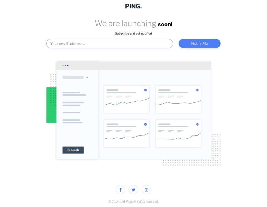
Design comparison
Solution retrospective
Anything that I can do to improve my solution for this challenge. Would be glad if You leave a feedback.
Community feedback
- P@FluffyKasPosted almost 3 years ago
Hiya,
This seems pretty good! Responsiveness is fine, too. There a few bits you could improve:
-
You could give some margin-padding to your container, so the content doesn't touch the sides in mobile view (at 375px it's already touching sides).
-
I believe the text "soon" shouldn't really have a different font-size as the rest of the title, it looks pretty odd.
-
Your social icons should be wrapped in a <ul> instead of a <div>. They should also be <a> tags, as they're clickable links. Adding some transition to them would make the hover state look a lot nicer too!
-
For the heading you should use a... heading element, not a paragraph. >.< An <h1> perhaps.
-
You should look up relative units. Setting everything in pixels - apart from a few small things like borders, box-shadows - isn't really good practice.
-
Your javascript: there's a typo in your alert message. Also, if this is your first attempt at javascript then it's okay, if not, I'd really really recommend not using var. We have let and const, use those. Also... if you used document.querySelector(".input"), you wouldn't get an array as a result but a single element. It's a small thing, but it would make your code more readable.
Marked as helpful1 -
- @Kamasah-DicksonPosted almost 3 years ago
Your solution looks great on both desktop and mobile. I also like your form validation which throws an alert.
To help with your accessibility issue, use an h1 on your heading.
Besides good job there👍 Happy coding💻👍
Marked as helpful1
Please log in to post a comment
Log in with GitHubJoin our Discord community
Join thousands of Frontend Mentor community members taking the challenges, sharing resources, helping each other, and chatting about all things front-end!
Join our Discord
