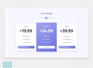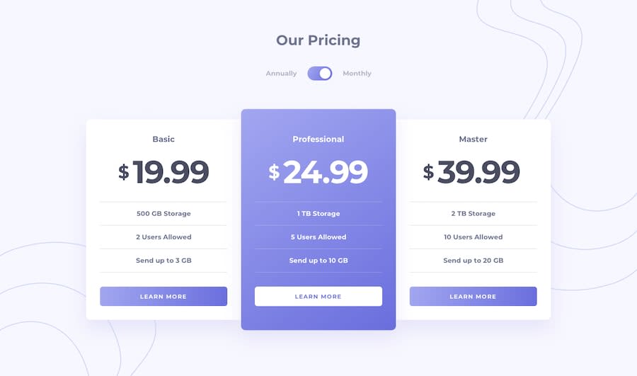
Design comparison
SolutionDesign
Solution retrospective
can you help me improve by criticizing my solution?
Community feedback
- @artimysPosted about 4 years ago
Hi there Bouhaouliane, You did a great job👍👍. It's responsive and were able to match the design pretty well.
-
I suggest adding focus state styles to your toggle and 3 card buttons. As I tab through I can't see where I'm tabbing through.
-
The top/bottom corners of the white cards that face the purple card are currently rounded. Remove the radius on just those 4 corners.
border-top-left-radius: 0;as an example
Happy coding!! 👍
0@jamelt50Posted almost 4 years ago@artimys yeah i didn't noticed that these one were not rounded in large screens , thanks a lot for your feedback !!
0 -
Please log in to post a comment
Log in with GitHubJoin our Discord community
Join thousands of Frontend Mentor community members taking the challenges, sharing resources, helping each other, and chatting about all things front-end!
Join our Discord
