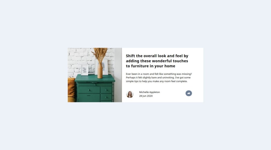
Design comparison
Solution retrospective
I'm so happy I managed to complete this tasks, it looked simple then I started doing it and then it looked undoable but at the end of it all, it is a very simple task.
So proud of the responsiveness, it's not really perfect though, but I believe I will get better
Community feedback
- P@whiteriver-devPosted 4 months ago
Besides some design details missing - overall looks good and mostly performs as it should.
Ensure to test your project on all device sizes. Once you go onto laptop size (1024px) your article breaks as the margin pushes out your content below the container.
Another thing is you can improve by writing more semantic elements in HTML such as using <sections> instead of using <div> for everything. Also if you only have element in a <div> like <h1> you don't really need that <div>
Besides that, couldn't find any other issues.
0
Please log in to post a comment
Log in with GitHubJoin our Discord community
Join thousands of Frontend Mentor community members taking the challenges, sharing resources, helping each other, and chatting about all things front-end!
Join our Discord
