Design comparison
Solution retrospective
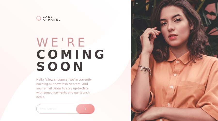
Hello, I am a Korean who is trying the front-end challenge for the first time. As a result of the challenge, I implemented a page on the desktop, but I wonder how to implement the screen when viewed on mobile, and I don't know how to decorate the css of the footer, so I ask for feedback.
Community feedback
- @zytuuPosted almost 3 years ago
Really good looking project for your first time trying it! In regards to your question about the mobile styles, I would recommend developing your website for mobile before you try developing it for the desktop. Until just a few months ago I too, had the same problem.
Things to do: -Research media queries -Research flexbox and flex properties -Research mobile first design workflow!
I really hope this helps, I know I'm not a professional myself, but I do hope this can give you something to work towards. I look forward to your future projects on frontendmentor! :)
Marked as helpful0 - @techantherePosted almost 3 years ago
Congratulations on completing your first challenge on FM, looks really nice! I think I should also recommend you to start with easy challenges first like 2 to 3 HTML and CSS only projects and then you are good to go. Especially after seeing this, I am sure you will learn a lot this way :)
0@badnuclearPosted almost 3 years ago@techanthere Thank you so much for the comments!
0
Please log in to post a comment
Log in with GitHubJoin our Discord community
Join thousands of Frontend Mentor community members taking the challenges, sharing resources, helping each other, and chatting about all things front-end!
Join our Discord
