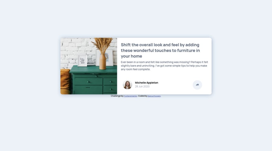
Design comparison
Solution retrospective
I did it responsive for the first time!!
There were two things I couldn't figure out:
-
how to turn the arrow white when I click on it. I tried everything I could find to change svg color but nothing worked.
-
how to make the bubble.
If anyone has some experiences to share I would really appreciate it.
Community feedback
- @ApplePieGiraffePosted about 4 years ago
Hi, Bianca Procopio! 👋
Good job on this challenge! 👍
And kudos for making your solution responsive! 🎉
I suggest,
- Adding a little more padding to the inside of the card in the desktop and mobile layouts to give the content a wee bit more room.
- Making your box-shadow just a little subtler would be a nice touch, I think!
- Adding some text to the
altattributes of the images for accessibility purposes. - You can create the popup by creating a separate element (using a
divor something), placing the social media icons inside it, and using a media query to position it differently in the desktop and mobile layouts of the site. You'll probably have to use absolute positioning to place the popup in the desktop layout (and, perhaps, also the mobile layout) of the site. You can create the little triangle under the popup with a pseudo-element. There's a lot to explain, so I'd recommend taking a look at some of the other solutions to this challenge if you'd like some more detailed ideas of how to do it! 😉
Keep coding (and happy coding, too)! 😁
2 - @AbePlaysPosted about 4 years ago
Use the "fill" property on svgs to change their color. I see you have referenced the svg as an image in your html. Just copy the svg code provided and paste it in place of img tag.
1
Please log in to post a comment
Log in with GitHubJoin our Discord community
Join thousands of Frontend Mentor community members taking the challenges, sharing resources, helping each other, and chatting about all things front-end!
Join our Discord
