Design comparison
SolutionDesign
Solution retrospective
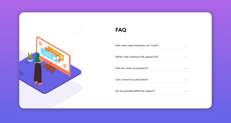
I'm satisfied with how it turned out but not satisfied with the orange box. I had to put it to position: absolute in order to make it work. I would really appreciate some suggestions on how to improve that (and everything else too).
I'm still working on the mobile version so disregard that.
=)
Community feedback
- @Antoine-FloPosted about 4 years ago
Hi Bianca ! 👋 Yeah this box is tricky, it took me a while to figure it out as well.
My suggestion :
- Right now each time we open a question it stays open, even if we open a new one. Eventually if you open all the questions it extend out of the card. Try to find a way to close the previous question each time a new one is opened (I have the same issue in my design 😅).
Great job 👍 and good luck !
0 - @ApplePieGiraffePosted about 4 years ago
Hey, Bianca Procopio! 👋
Good effort on this challenge! Your accordion card works pretty well! 🙌
I suggest,
- Decreasing the width of the accordion card just a bit. It's quite large at the moment.
- The floating cube can be tricky to place! I suggest wrapping the accordion and cube SVG in a
divand then using absolute positioning to place the cube relative to the wrapperdivso that it remains it its place and doesn't get cut off if you setoverflow-xto hidden for the accordion card itself. 😉 - As you mentioned, the next step would be to make this solution responsive. Looking forward to that!
Keep coding (and happy coding, too)! 😁
0
Please log in to post a comment
Log in with GitHubJoin our Discord community
Join thousands of Frontend Mentor community members taking the challenges, sharing resources, helping each other, and chatting about all things front-end!
Join our Discord
