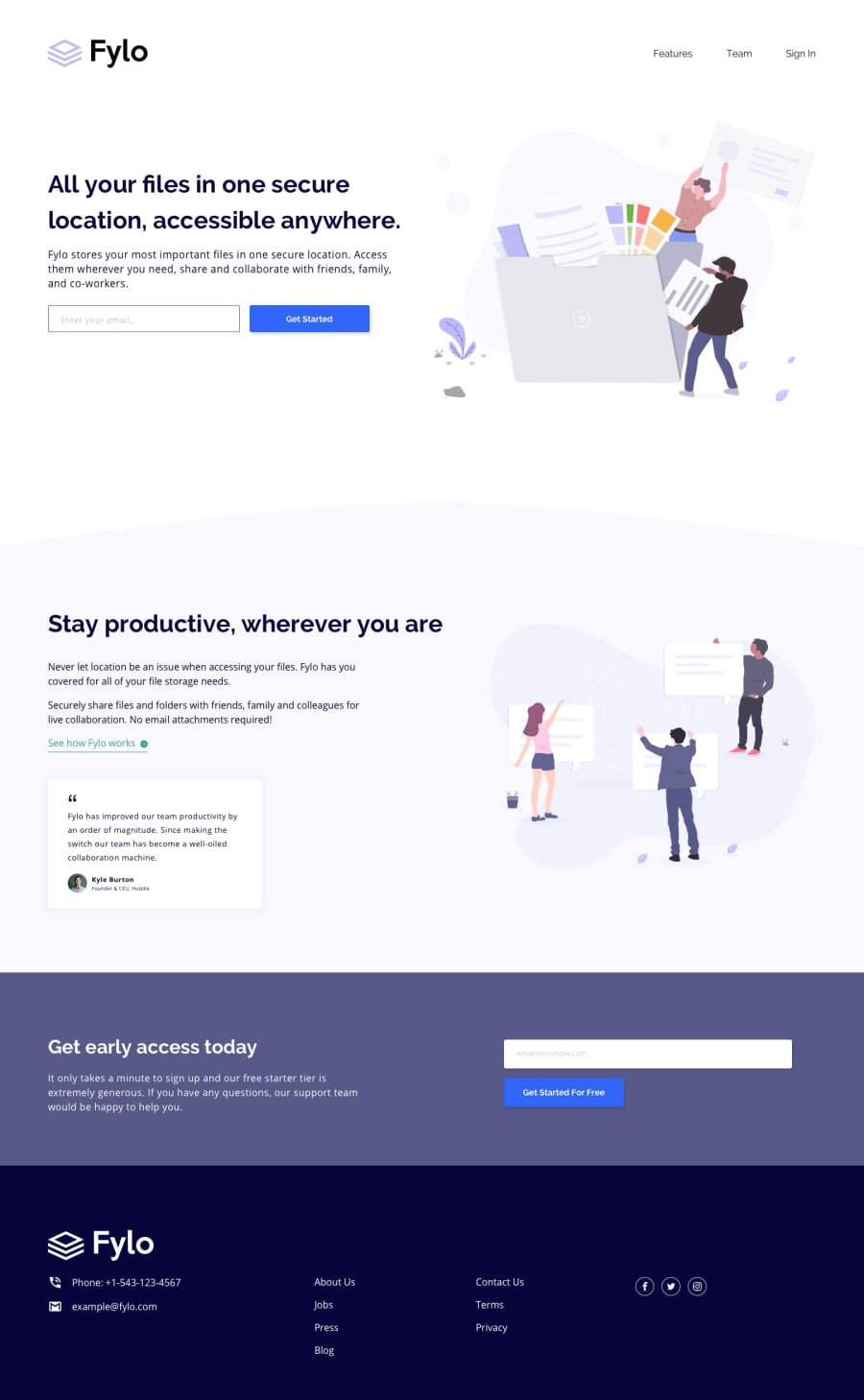
Design comparison
Solution retrospective
Please comment on this work... how the codes were structured , method used in styling and the naming convention. please comment and give advice on how to improve
Community feedback
- @adarshcodesPosted over 4 years ago
Hi! @abdulsalamcodes, your solution to this challenge looks great👍. You can consider a few changes-
- Add some padding to the top and decrease the size of the logo.
- Add some margin between the navigation links.
- The background image of the middle section with a curved section is missing.
- Responsiveness works great👏
- Solve the Accessibility and HTML issue.
1 - @KoichaDevPosted over 4 years ago
Hey! Pretty cool website!
I would suggest you to:
-
split your CSS to an external file to give a better readability
-
Try to use BEM convention. Not just you are going to code, but someone else can read your code and easier to understand better what all of your class names is
-
box-sizing: border-box; on the universal selection of your CSS on your CSS. This will reset all of the padding and margin on the box model. Not all of the browser has equal consistent margin, padding and display value, such as inline, block or inline-block.
-
If you can, try to adapt SCSS 7-1 folder structure. Give it also a variable name for your font and colors. It will keep the code DRY (Don't repeat yourself). Try to write it on Vanilla CSS instead.
Overall, I think it's a pretty good job you have done. You could fix a bit of the styling design as @adarshcodes mentioned!
Keep rocking!
1 -
Please log in to post a comment
Log in with GitHubJoin our Discord community
Join thousands of Frontend Mentor community members taking the challenges, sharing resources, helping each other, and chatting about all things front-end!
Join our Discord
