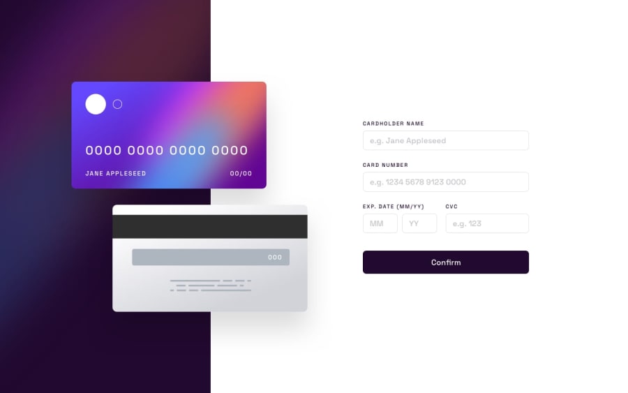
Design comparison
SolutionDesign
Community feedback
- @UserAhmad2001Posted over 2 years ago
Hey jorge 👋
CONGRATS ON COMPLETING THE CHALLENGE
YOU DID AN AMAZING JOB 🥳
I got some small tips for you:
- You should reduce the width of the month & year & cvc fields to be nore like the design.
- Also make sure the user can't write more than he is allowed in the number fields.
- Add
cursor: pointer;to the buttons.
This is my Solution, it should give you a vague hint of what you should be doing.
IF YOU HAVE ANY QUESTIONS, I'M HERE
HAPPY CODING
Marked as helpful0
Please log in to post a comment
Log in with GitHubJoin our Discord community
Join thousands of Frontend Mentor community members taking the challenges, sharing resources, helping each other, and chatting about all things front-end!
Join our Discord
