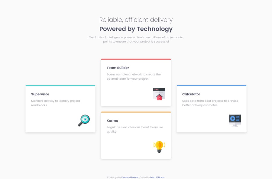
Design comparison
Solution retrospective
Pretty happy with how this one turned out, if you reckon there's something I can change to improve it please let me know. Thanks!
Community feedback
- @SzymonRojekPosted almost 4 years ago
Hi Leon,
Well Done :D
I have checked mainly your HTML structure, a few tips from me:
- I'd recommend reading more about semantic tags and BEM naming convention;
- I would remove this section class="testimonials";
- instead of div class="main" you can use the main* tag here;
- alt text can be empty alt=" " because icons are only decorative so they can be ignored by assistive technologies, such as screen readers;
- RWD: what do you think about tablets? you can start from one column (mobiles), then create two rows with two boxes each, finally => desktop design pattern.
Greetings :D
1@leon-bwPosted almost 4 years ago@SzymonRojek Thanks for your help, I've added in a tablet view and made the changes to section, main and alt tags. I will definitely take a look at the BEM naming conventions, I didn't even know this existed thanks so much!
1@SzymonRojekPosted almost 4 years ago@leon-bw
I am glad. I will send later a few good articles about BEM if you want them :D
Cheers!
1@leon-bwPosted almost 4 years ago@SzymonRojek Yes please, I'd really appreciate that. Thank you for taking out the time to do so :)
0@SzymonRojekPosted almost 4 years ago@leon-bw
I like these links:
Check it out :D
1@SzymonRojekPosted almost 4 years ago@leon-bw
Also, I' recommend learning Sass:
Learn it slowly - it takes time but step by step you will be better, I am sure about it.
Don't forget to upvote any comments on here that you find helpful.
Happy time! :D
1@leon-bwPosted almost 4 years ago@SzymonRojek Ohh fantastic! Thank you so much these will really help me improve! I appreciate you coming back to share these with me :D
Happy coding! :)
1@SzymonRojekPosted almost 4 years ago@leon-bw
You're welcome. It is pleasure to help when I have a time to do it. I have forgotten to mention, I have published the same challenge on my profile frontendmentor.io => check it out :D
Keep going! :D
1@leon-bwPosted almost 4 years ago@SzymonRojek I've just seen it. Your submission is basically perfection haha! Awesome job! Hopefully I'll be able to get to your level soon. I added a heart on your solution :)
1@SzymonRojekPosted almost 4 years ago@leon-bw
Thank you so much. That’s very nice! :)
0
Please log in to post a comment
Log in with GitHubJoin our Discord community
Join thousands of Frontend Mentor community members taking the challenges, sharing resources, helping each other, and chatting about all things front-end!
Join our Discord