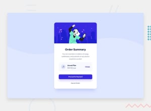
Design comparison
SolutionDesign
Solution retrospective
Any comment or advice is so valuable to me.
Community feedback
- @pikapikamartPosted about 3 years ago
Hey, great work on this one. Layout looks bigger than the original but it's fine I guess? But scaling it down would be really awesome.
Some suggestions would be:
- Your
background-imageon thebodytag is using a wrong path, do not use/root path when deploying in github, because it won't work, change the path into./. - Always have a
mainelement that will wrap the whole content of the page.mainelement helps users to properly navigate your website. - The
altfor the vectorimgshould have been left empty likealt=""since it is just a decoration. When an image only acts as a decoration, usealt=""on it, but if theimgadds content, then use descriptivealtvalue. Also, avoid using words that relates to "graphic" like "background, image, picture.." as a value foralt, assistive tech will handle those for you. - Great that you made the
annual-plana heading tag, but the choice of tag level is wrong, if you useh4make sure thath1, h2, h3appears before it. Do not skip a heading level if you are going to use it. - I would use
atag for all the interactive elements, since the card itself is not aformthenbuttonis not really suited, unless there is a modal right, but since there aren't any,atags are more preferable.
Aside from those, great job again on this one.
Marked as helpful1 - Your
- @ashiqfuryPosted about 3 years ago
Great work.
- Add
max-widthproperty in desktop view, so that thecontainerdoesn't grow too much. - Use
flexboxlayout to make your code easy and clean. It also makes your design responsive.
Thanks
Marked as helpful0 - Add
Please log in to post a comment
Log in with GitHubJoin our Discord community
Join thousands of Frontend Mentor community members taking the challenges, sharing resources, helping each other, and chatting about all things front-end!
Join our Discord
