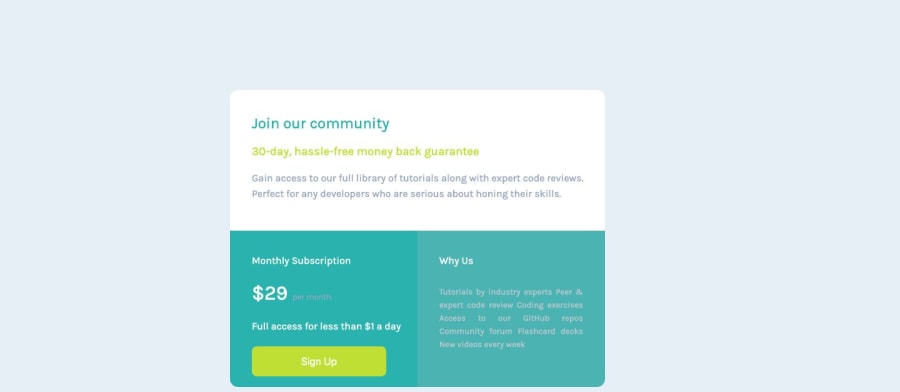
Design comparison
Solution retrospective
Any suggestions on it good be improved greatly appreciated. Will not start on another project.
Community feedback
- @willcook4Posted about 5 years ago
Great first crack... I think your 'per month' text and your 'why us' list is the wrong color. Check the design again, I don't have the .sketch file though.
Consider cleaning up the index.html to make it flow. The indentation is a bit wonky making it harder to read.
'Why us' should probably be an unordered list. It reads like a list.
Consider cleaning up the spacing in the stylesheet. Your line breaks are inconsistent making it harder to read. Your indentation is inconsistent for .right-box on mobile.
Give it a tidy up, in general it's looking the part
3@amidabrian51Posted about 5 years ago@willcook4 Thanks for your suggestions. Will try and do these soon.
0 - @argelomnesPosted about 5 years ago
Hi Brian,
Good job! Adding to @willcook4 :
- Link your html to the correct font. CSS is already using 'Karla' so that's good.
- You can remove the horizontal paddings in headings and paragraphs and instead use it in their containers. ie, .left-box and .right-box
1@amidabrian51Posted about 5 years ago@argelomnes Thanks for your help. Will try and do these soon.
0
Please log in to post a comment
Log in with GitHubJoin our Discord community
Join thousands of Frontend Mentor community members taking the challenges, sharing resources, helping each other, and chatting about all things front-end!
Join our Discord
