Submitted over 3 years ago
Html css and bootstrap solution of huddle landing page

@faiyaz-rahman13

Design comparison
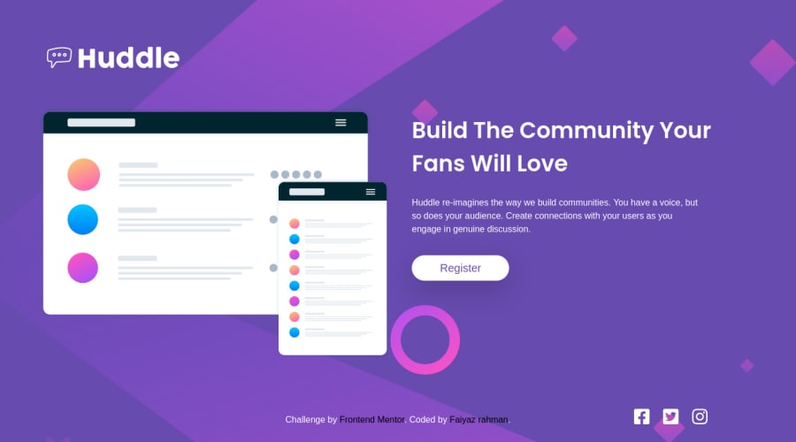
SolutionDesign

Solution retrospective
Do let me know how the website looks, how much responsive it is, and how can I make it look more good and make it more responsive. I would like to know you're opinion and I would love it if you point out my mistakes and help me develop my skills. thank you 😊😊
Community feedback
Please log in to post a comment
Log in with GitHubJoin our Discord community
Join thousands of Frontend Mentor community members taking the challenges, sharing resources, helping each other, and chatting about all things front-end!
Join our Discord