Design comparison
Solution retrospective
I am gaining lot of knowledge by doing this challenges. Hope to get some suggestions from your side, this will help me to improve.
Community feedback
- @palgrammingPosted over 3 years ago
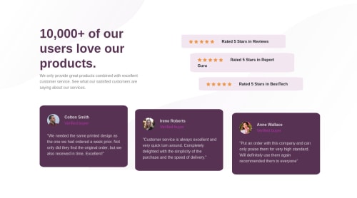
for your star containers if you open up a browser window to 750px wide you will see that to of your star containers with class name "middle" and "bottom" are not like the one "top"
to style the star container you should make one class lets call it .star-container that would hold every property that controlled the look of each star container
if you wanted to have your top middle and bottom then I would give them IDs not classes and call them example #star-top #star-middle #star-bottom since ID can only be applied to one element I think it will help to keep your code cleaner. Them you could position each container with their ID and control appearance with the common share style between them
also the inline styles in your HTML that you have should be avoided unless it serves a real roll that would not work if it was in the style-sheet
0
Please log in to post a comment
Log in with GitHubJoin our Discord community
Join thousands of Frontend Mentor community members taking the challenges, sharing resources, helping each other, and chatting about all things front-end!
Join our Discord