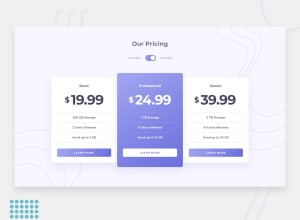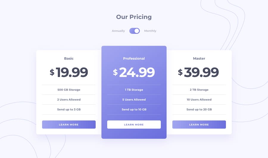
Design comparison
Solution retrospective
Im relatively new to front end development, so I have a lot to learn. If you see something in the file structure, workflow or something else in my code that needs improvement please let me know!
Community feedback
- @ovidiuantonioPosted over 4 years ago
Hello Nathan,
Your solution looks great! You did an amazing job here! I found 2 little things that you can add to your solution to make it look a little better:
- add transitions to the hover states to make the things smoother
- adjust the width of the cards in the tablet mode (700 - 1030px), they are kinda too big in width in my opinion
As for the file structure, try to group your css in one folder, and if you have more than one css file, import all in one additional css file to have just one
linkin your html.Happy coding! Keep going!
1@nathanziarczykPosted over 4 years ago@ovidiuantonio thanks for the great feedback! I'll work on it!
0 - @DarknessflowersPosted over 4 years ago
Hi, this looks good! A couple of things: the prices could be a little bigger, and the challenge requests for the toggle to work with keyboard as well as the mouse. I don't think it would take much altering to your current JS, just add an event listener that listens for keyup or keydown and then toggles based on the keys (I used arrow keys for my version). But your JS was a lot shorter and to the point than mine. Great work!
0@nathanziarczykPosted over 4 years ago@Darknessflowers you’re right! Totally forgot about the keyboard toggle part... I’ll fix it asap
0
Please log in to post a comment
Log in with GitHubJoin our Discord community
Join thousands of Frontend Mentor community members taking the challenges, sharing resources, helping each other, and chatting about all things front-end!
Join our Discord
