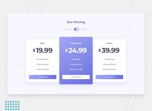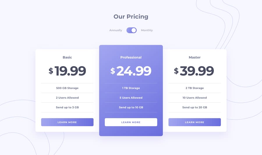
Design comparison
SolutionDesign
Solution retrospective
All solutions and feedback are welcome
Community feedback
- @juandadevPosted over 4 years ago
There are some issues you need to fix/improve:
- I recommend you add the fonts in the HTML Document in a link tag getting the embed code from Google Fonts.
- Your background image looks different from the original one.
- Add a
border-radiusto thecontent-1,content-2andcontent-3containers and buttons. - Also, try different values for the
blur(third parameter) andspread(fourth parameter) in thebox-shadowproperty looking similar to the original design. You can use this tool that generates automatic code forbox-shadow. - The
content-2container for the Professional plan includes a gradient background with white, again you can use this tool to generate the code for the gradient as the background. - With
text-transform: uppercaseyou can change the style of any text, including the one inside of the buttons of learn more.
That's all I can see now, good work, and keep coding and learning every day! 😁
1
Please log in to post a comment
Log in with GitHubJoin our Discord community
Join thousands of Frontend Mentor community members taking the challenges, sharing resources, helping each other, and chatting about all things front-end!
Join our Discord
