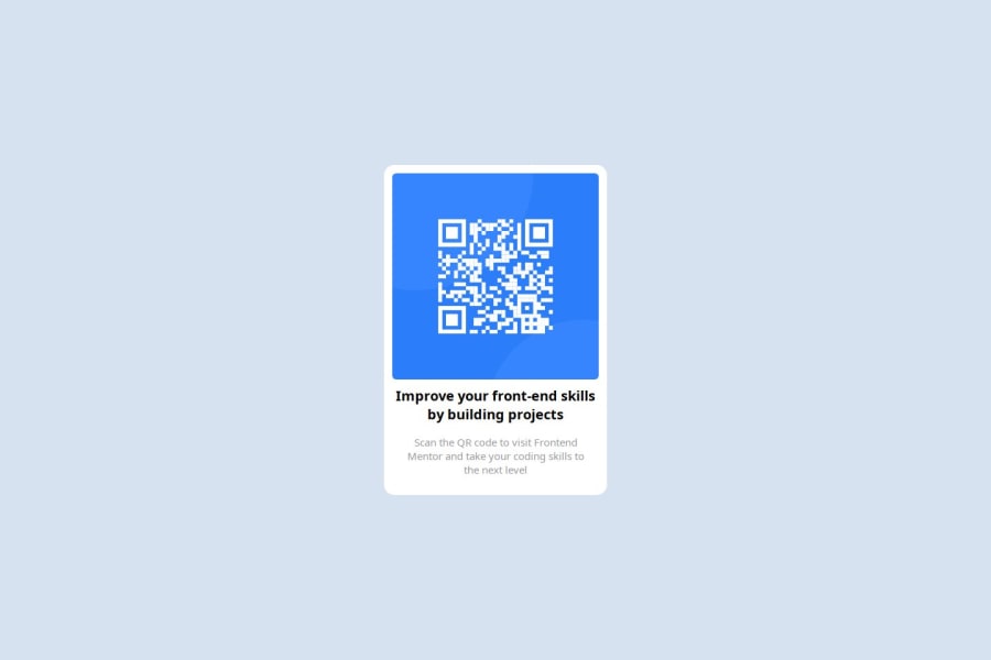
Design comparison
SolutionDesign
Solution retrospective
What are you most proud of, and what would you do differently next time?
Been able to get everything all centered
What challenges did you encounter, and how did you overcome them?No challenge
What specific areas of your project would you like help with?None
Community feedback
- @fastcheetahPosted 3 months ago
Hey ,congrats on your first project. It looks very close to the design but I want to point out the fact you should use rem and not pixels when using font-size because its useful for scaling CSS elements in relation to the size of the root element . You can calculate by dividing your pixel value over 16. Again nice work on your first project🔥🔥🔥 If you found this helpful Mark this comment as helful
0
Please log in to post a comment
Log in with GitHubJoin our Discord community
Join thousands of Frontend Mentor community members taking the challenges, sharing resources, helping each other, and chatting about all things front-end!
Join our Discord
