Design comparison
SolutionDesign
Solution retrospective
any hints
Community feedback
- @MieszkoKowalikPosted about 3 years ago
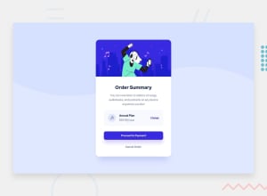
Looks really good. Some padding/margins are slighlty off, but overall it's good.
I have few tips for you:
- You have to be carefull when using em's for the font-size property, on bigger projects that can become a pain in the ass. You usually would want to use rem's instead.
- You could try to use more em's on paddings and margins, especially for buttons. This means that if you ever want to change the font-size of the element, you will kip the proportions.
- wave background image is broken for higher resolution widths. The pattern of the wave looks like it should look good if you repeat it on x-axis with "repeat-x"
Marked as helpful0@alaaymanPosted about 3 years ago@MieszkoKowalik Tank you for the tips they are great
0
Please log in to post a comment
Log in with GitHubJoin our Discord community
Join thousands of Frontend Mentor community members taking the challenges, sharing resources, helping each other, and chatting about all things front-end!
Join our Discord
