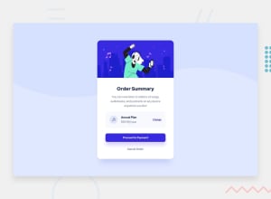
Design comparison
Solution retrospective
What could've been done better in terms of code simplicity? And any criticism would be welcomed.
Community feedback
- @MarlonPassos-gitPosted over 3 years ago
- to solve your problem with the background you should use the following code
background-repeat: none; background-color: hsl(245, 75%, 52%);-
You added borders to the card, the original design didn't have borders
-
change the mobile version background to the given svg
pattern-background-mobile.svg -
It was asked that the buttons have some effect when the mouse is over it, at least you should add
button:hover { pointer: click; }-
The original width of the card in the desktop version was 400px, solve that!
-
Your site breaks for mobile devices with less than 350 px, in my sansung galaxy fold it doesn't work right. Probably on smaller devices this also happens
-
Your HTML doesn't have any semantics, it's full of Divs and Spans, there are specific tags for buttons, links, paragraphs, text you could have used. Do a search there
-
In CSS I recommend you use Variables for font sizes, colors and so on. The way you put it is very difficult to maintain in the future.
-
It's interesting on your github you put more information about the project, what you used, what you learned, an image of the final project. So you can help other people who will be "inspired" with your project and future contractors to see what your reasoning is.
Marked as helpful0
Please log in to post a comment
Log in with GitHubJoin our Discord community
Join thousands of Frontend Mentor community members taking the challenges, sharing resources, helping each other, and chatting about all things front-end!
Join our Discord
