HTML CSS
Design comparison
Community feedback
- @DanCodeCraftPosted about 1 year ago
Good one, @KaueACLima!
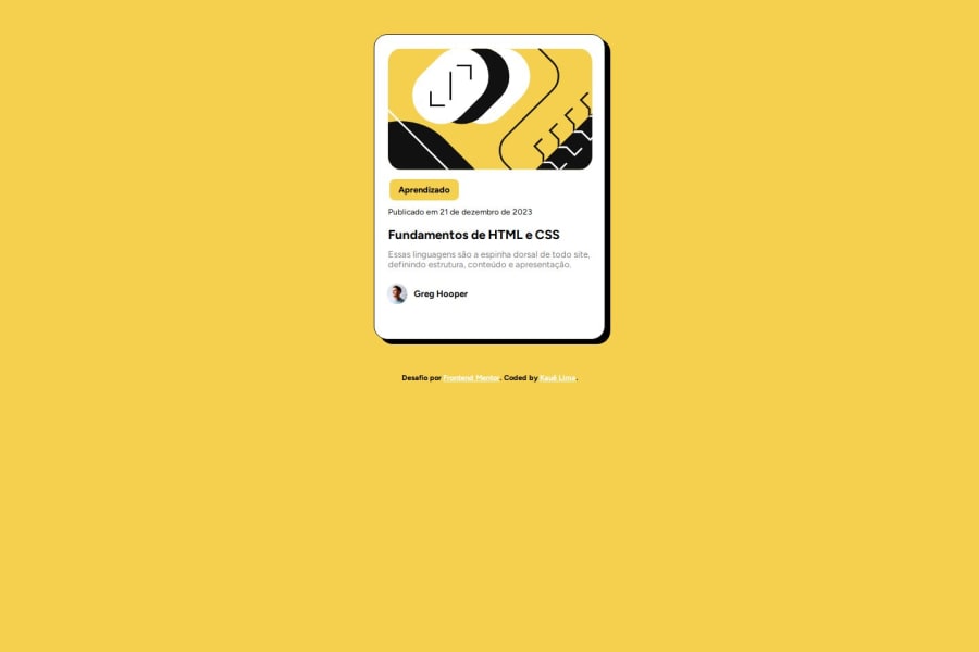
I see you're missing a few things that will make your project even better! First things first, there's a simple way to centralize your component in the screen:
body {
    min-height: 100vh;
    display: flex;
    justify-content: center;
    align-items: center;
}
The hovering states are missing for the header of the card, and the box-shadow. To solve this, you will simply have:
.class:hover,
.class:active {
    color: your_color_of_choice;
}
The above is just an example. You can change the properties you want to, like color, size, font, or whatever your project demands you to. Also, do not forget to add a transition property in its parent element. It takes you one line:
.class:link {
    transition: all 0.2s;
}
And you have a good, smooth experience.
Keep up the good work!
0
Please log in to post a comment
Log in with GitHubJoin our Discord community
Join thousands of Frontend Mentor community members taking the challenges, sharing resources, helping each other, and chatting about all things front-end!
Join our Discord

