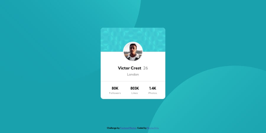
Design comparison
Solution retrospective
Hi guys, this is my first project so I really apreciate any comments and suggestions you can give me. I'm very happy I finished it!
Community feedback
- @AbhijitSarodePosted about 3 years ago
Hi Nicolas,
Your code looks pretty good for your very first submission.
<header> and <footer> tags are usually used for header and footer of the page not the component as it may create confusion if someone is using accessibility settingsYou can use responsive measuring units like rem, em, vh, vm, ch etc instead of px but be aware of the additive nature of some of the responsive units
I'll suggest you look into BEM for future submissions. Plenty of people here use good BEM, you can read their code to get better idea about it
Hope this helps
Marked as helpful0@NicolasEirizPosted about 3 years agoHi @AbhijitSarode , thank you very much for your feedback.
You are right, it doesn't make sense using header and footer in a card design, I have seen your resolution and noticed that you used div for that, I will implement it in the next one.
I have no idea what BEM means haha, I will do some research for the next one.
Comments like yours really encourage me to keep moving forward, I appreciate you for taking the time and best regards!
0@AbhijitSarodePosted about 3 years ago@NicolasEiriz we all need encouragement and support. I am glad I could help you in your journey
Marked as helpful0
Please log in to post a comment
Log in with GitHubJoin our Discord community
Join thousands of Frontend Mentor community members taking the challenges, sharing resources, helping each other, and chatting about all things front-end!
Join our Discord
